
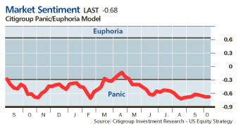
Its pet peeve time again: Back in May 2005, we noted that Citibank’s Panic/Euphoria Model has slid into panic mode, despite markets behaving not too poorly.
This week, the market saw the Dow finally climbing above its former January 2000 peak to an all time high; it rose 171 points, or 1.5%, to reach 11,850. The S&P 500 tacked on a 1%, while the Nasdaq rose 1.8%, to 2299. The Russell 2000 outperformed the other indexes, advancing 2%.
This can only mean one thing to the computers at Citi: WE ARE IN PANIC MODE. Proof is their Market Sentiment Panic/Euphoria Model:
>

Chart courtesy of Barron’s
>
That’s right. According to Citibank, we have slipped ever deeper into panic mode.
I’m not one to tell either Barron’s or Citigroup how to do their business — but this has now reached the point of absurdity. I would like to hear from someone (Tobias? Mike?) how on earth we are in a form of Panic sentiment right now.
Note: I am not saying this measure has no value; But I am suggesting that either the nomenclature or the scale (at right of graph) is somehow off.
Since its proprietary, we do not know what this black box measures; The only thing we are faiirly certain of is that it is not accurately measuring Sentiment . . .
>
Sources:
Common Sense
Inate
DNA
A Sparkling New High for the Dow
MICHAEL SANTOLI
THE TRADER
Barron’s MONDAY, OCTOBER 9, 2006
http://online.barrons.com/article/SB116017686346985459.html

Back in November 2005, The Big Picture had this to say about the the Panic/Euphoria Model:
“As is always the case with anything remotely resembling a black box, ‘the particular methodology behind the model is proprietary and undisclosed.’ However, the components of the model is disclosed, and includes:
“margin debt balances; daily Nasdaq volume as a percentage of NYSE volume; an average of Investors Intelligence and American Association of Individual Investors bullishness surveys; retail money-market fund balances; the ratio of put-option to call-option volume; the CRB commodity-futures index; gasoline prices; and the short-interest ratio between public investors and NYSE member firms.”
Impossible to know how they weight each of these (and I’m quite sure a lot of form-fitting was done to get the desired historical results), but perhaps by looking at each of these components we might determine how this model remains in “panic” territory despite the price action of the market…
I think perhaps they are getting fooled by historical trends. Short ratios, for example, have hardly been trendless. If Citi were careless in massaging their data, then long-term trends may have helped fool a model which, by its nature, must be reverting over time.
I’ve asked Barron’s to see a long term chart of the Panic/Euphoria index plus the actual date it was instituted in order to evaluate back-testing bias but to no avail. If anyone has this data please post it here. Thanks.
Here’s my explanation of why it is registering panic: So many of us smugly thought we would beat (indeed profit from) the 4 year, 20 year, sunspot and Jupiter/Saturn/Pluto configurations that we bought, and steadfastly held onto, put positions that are making us weep and feel a bit panicky!
They must know something we don’t, because if we’re keeping our heads while they panic then we haven’t yet heard the news they’re hearing.
LOL, anon, post that garbage somewhere else little man. You obviosuly don’t know what a Communist is, because the Bush Admin, and the Neo-cons seem awfully like Lenin(the puppet) and the Godless Commies(the true powers) in their ways.
Oh, yeah, the economy is that bad. Militia’s are not forming in the Midwest for no reason sir.
Barry,
You’ve misinterpreted the chart. It is much more robust than any chart you’ve seen before.
When in a bearish type market, anything that rises out of the panic area, we should panic and sell.
In a bullish market, anything that decreases out of the euphoria area should be bought b/c we all want to be euphoric.
I just LOVE charts with “unit-less” numbers. I also love that the panic dividing line is at -0.3, sort of. But the euphoria dividing line (I THINK — the “gray” area in the middle isn’t labelled — maybe that area is “comatose”) is kind of above +0.6 or so.
I guess this chart suggests that we’ve been in constant panic of late, and that it’s easier to be paniced than euphoric.
I can relate to that.
Fun aside, the chart looks to me like a measue of market trending — the lower the value, the more aimless and confusing things seem to be.
I can relate to that too.
the lasttime I thoguht about it is that panic represents a buying oppourtunity. Is panic an equivalent to despair?
I am really sorrt to say for the last few weeks the blog has been a bit like Oakland. this is a reference to Gertrude Stein.
What are we talking about?
Who is in a panic? Over what?
Perhapswe should be talking about how to make money out of the behavior of anticipated price changes in any given market?
If we are so damm worried about the stock market going down then we should be talking about how to make money off it.
Anyone want to mention that Jim Rogers points out in his boo that there is an inverse correlation of the stock market to commodiites?
All this up versus down is so much crap without context and time duration for the investment. It is not about up or down as much as which side of the bet do you want to take? Or do you want to take the bet at all?
How about what is cheap? How do we define cheap? Where should we look for cheap? Can we oinvest in it? How will we know when the party is over?
Now if it is a topic like how politics can or cannot influence prices of anything well then we can have a discussion.
Excuse this rant but I want some meat on the bone!
Huh? Yeah, great disgustion. Disgustion!
Barry’s right. They need to recalibrate. I see little panic. Markets don’t go up several days in a row in panic mode. And make new highs?? It’s a lousy model; or else its stretched way wrong.
Me? Still levered to natural resources. Short the S&P. We’ll see.
Loved the survey of homeowners. Good grief, 70% think their home will go up in value over the next few years and very few think their in trouble with their mortgage? Uh, yeah………
I think Citi’s black box measures the sentiment of Yankee fans.
It appears that the model does not accurately reflect real-time emotional state unless they define panic as investors panicking about missing a train and jumping into the market. According to this model the market has been in the panic zone for the last 14 months (except a small spike in April).
Seriously, it appears the model is not designed to measure the emotional state, but is a statistically derived structure to gauge investors’ actions.
Tobias M Levkovich: “Our exclusive Panic/Euphoria Model further bolsters the positive market view as it remains in “panic” territory, which suggests a better than 95% probability that stock prices should be higher in a year’s time. On average, the market has gained 19% over the subsequent 12 months when the model was in panic territory.”
must be a buying panic by money managers,try turning the chart upside down.
In 2000 their model was in euphoric zone when the conditions were deemed as positive (and the market went down). Currently, their model in panic zone when the conditions are deemed as challenging (and statistically they suggest that “a better than 95% probability that stock prices should be higher in a year’s time”.)
Does anyone have a graph of their data going back more than 14 months?
At the Market top in May this model was still in panic mode.So may be it’s just forecasting that we should all be in a panic mode right now.Pun apart this probably isn’t the right indicator to gauge the sentiment.Even if it’s right sentiments not going to dictate the fundamentals, it’s the other way around.The fact is in the garb of credit tightening we have monster credit expansion.All Fed has done is raise short end rates, but the reserves have actually grown faster this year.So where is the lack of credit when credit tightening is the purported objective.Hence we have rising inflation.That’s not going anywhere.One wonders why they stopped publishing M3 anymore ? Trying to hide something from someone may be? Any way the finest insurance for inflation: Gold.Dollar will crash gold will boom, bond market has topped.I am sure Fed will continue to try to save housing by pumping liquidity through the long end bond market but I would be too naive to beleive they are going to suceed without causing hyper-inflation.Weimer hyper inflation Redux anyone?
Probably not, some sanity might still prevail you know.Final outcome rising interest rate, super hard landing for Housing and the worst recession in decades.
Looking at their Panic/Euphoria Model dated back to 1987; the last time it showed the same level of panic (approx negative 0.7 on composite axis) was in 1994-95 and in 1989.
The spike of positive 1.8 was in 2000-01.
>>>Looking at their Panic/Euphoria Model dated back to 1987; the last time it showed the same level of panic (approx negative 0.7 on composite axis) was in 1994-95 and in 1989.
The spike of positive 1.8 was in 2000-01.<<< Someone please clue me in. Where is the longer term chart beyond the one Barry presents? Someone point an ignorant fool in the right direction...please!...
It’s in most of Tobias’ PULSE stuff he puts out on a (weekly?) basis. I’ll see if I can hunt down an image for you.
Ah Ok, here’s a link:
http://images.businessweek.com/mz/05/47/0547_154plus.gif
Note that last I checked, the CSFD and DrKW indicators are telling you the exact opposite.
Got it. Thanks. Looks good on the surface, but something about that chart stinks to me as well. Maybe I’ve been hanging around on this blog too long.
I’m going to mull it over and figure out what it is that bugs me.
That is…besides the fact that we’ve been in panic mode the last 2+ years. Maybe it’s all relative…
I don’t have a problem with the chart per se, but Citi also prints out the chart for other countries, and it holds up a lot less well for non-US countries. I’m not sure if they are changing the weightings at all, but I’m going to assume that they don’t – or at least wouldn’t without telling people.
My problem with it is more nomenclature (like Barry), though one can always question whether or not the data covers a large enough period.
I never rely on anyone data source, and in particular prefer transactional basd sentiment reads (Arms Index, Put Call Ratio, % of stocks over their 20/40 day MA, etc) to sentiment surveys.
That said, you can see several sent surveys here: Investor Sentiment Readings
They are all rather “optimistic” — AAII being the exception
“Got it. Thanks. Looks good on the surface, but something about that chart stinks to me as well. Maybe I’ve been hanging around on this blog too long.
I’m going to mull it over and figure out what it is that bugs me.
”
Any measure that spends most of the time since 1980 in “panic” territory and raises its head during 2000 will seem a good measure.
Thing is, how would such a measure fare during other kinds of markets (1960-1980, for instance). Because 1980-2006 is the SAME kind of market with the tech bubble exception.
The upwards bias of the market over the long term suggests that 12 and 24 months after ANYTHING (Full moon, lunch with the Queen, adult circumcision), indices are higher.
That’s why I find the Citibank Panic/Euphoria measure as presnetly construed of limited value.
Its also why I bristle at the term “Perma-bear” — 1) Its not accurate, and 2) I know that over the long haul, excessive bearishness is a losing strategy.
For the record, when I flipped Bullish in October 2002 (Pre-blog), I was accused of being a perma-Bull. So it is a bit of a contrary indicator of the real “PERMAS” when that accusation starts flying . . .
I think the one thing we can safely say is that the index does not give much weight to falling unleaded gasoline prices.
Maybe it’s just a measure of Conservative political confidence.
not clear why no one has mentioned that the index went out of “panic” mode just before huge sell off in emerging markets and small caps.
Hmmm.Gives some creedence to contrarian indication. I’m bearish, but even my jaundiced eye caught that– if people are not going to consider data contrary to their point of view [and there is data to support this– people seek out blogs that confirm their views, not to ‘learn’]–then what’s the point?
second, I wonder what the esteemed panel thinks of my latest “meme” on this sentiment angle–in general in the post blog/internet world. I mean, “sentiment” now turns on a dime it would seem, as opposed to the ‘old days’ when the measure cut it’s chops and things moved like a battleship.
may all be worthless, IOW
I got the list of indicators Citi incorporates into this model (not sure if it is all inclusive).
Margin Debt
NASDAQ daily volume as percentage of NYSE volume
Composite average of Investors’ Intelligence and American Association of Individual Investors
Retail money funds
Put/Call ratio
CRB futures indices
Petrol Prices
Short interest ratio between public and member firms
Could it be the falling oil prices (20% drop) keeping their model in a bullish territory (panic zone)?
HT,
Maybe you should read this blog again. I am sure you will find (if you want to see it) that some have mentioned “a small spike in April”.
Most of the support for the market has been coming, ever since July or so, from excessive bearishness.
But then again, there are unusually powerful reasons for being bearish, and there’s 0 likelihood those will go away, because debt doesn’t go away unless paid.
I dunno, BR. The put-call ratio is near 1. Not exactly showing wild bullishness. I think most folks have been expecting a slowdown and have been treading lightly, and they’ve been wrong.
Regarding the Put/Call, one needs to look carefully at the kind of puts and calls being bought.
I’m seeing a lot of deep out of the money puts, those are near worthless but skew the ratio significantly.
BR- only thing I can think of is someone flipped the graph up side down OR allot of people are really greedy, long and paniced over their deepest inner thoughts….I think the Sentiment.com bar was optimistic day before yesterday. Where are the put/ call ratios?? It was observed that the spike in put/call the otherday was primarily due to HAL puts. Friday, I observed pretty sporty
IWM put call ratios esp. in November. It will be a tricky Halloween!
how can we say it’s even a remotely accurate indicator if we are making new market highs as the indicator is showing “panic”. Lets be honest, the indicator sucks.