
What is a cartogram? Its a map in which the sizes of states are rescaled according to their population, as opposed to their land mass.
The apparent paradox of traditional maps is that they fail to take into account population distribution.
We can correct for this by making use of a cartogram, a map in which the sizes of states are rescaled according to their population. States drawn with size proportional not to their acreage but to the number of their inhabitants. On such a map, for example, the state of Rhode Island, with its 1.1 million inhabitants, would appear about twice the size of Wyoming, which has half a million, even though Wyoming has 60 times the acreage of Rhode Island.
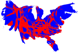
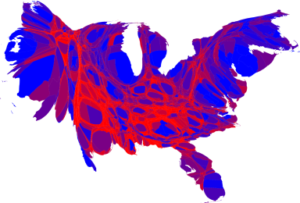
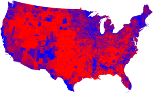
The difference between geography and population can be quite significant, as these election maps reveal:
Election results by county
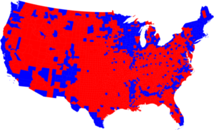
Election results by county
Source: U Mich
Sources:
Maps of the 2008 US presidential election results
Mark Newman
Department of Physics and Center for the Study of Complex Systems University of Michigan
http://www-personal.umich.edu/~mejn/election/2008/

What's been said:
Discussions found on the web: