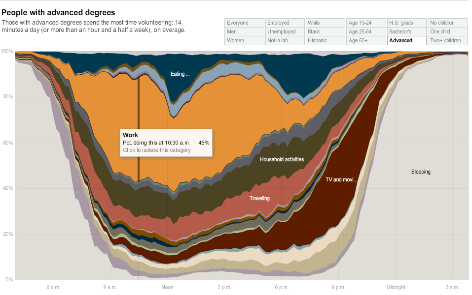
Interesting NYT interactive chart showing how people spend time over the course of a day. It is also broken down by gender, age, race, education, etc.
It is kinda weird seeing how people spend their time each day: Note that the chart shows the percentage of what EVERYONE is doing at a given money over the course of a day doing a given activity at that moment.
On a personal note, I spend a lot more time using computers and on the internet than I do watching TV — the opposite of what most of the country does . . .
>
How Different People and Groups Spend Their Day
click for interactive graphic

chart via NYT
>
Source:
For the Unemployed, the Day Stacks Up Differently
AMANDA COX, KEVIN QUEALY and AMY SCHOENFELD
NYT, July 31, 2009
http://www.nytimes.com/2009/08/02/business/02metrics.html


What's been said:
Discussions found on the web: