Our chart of the day comes to us via Tom Keene’s blog, Econochat:
Two views of our national net worth assumed to be a proxy for households (although it also includes non-profits and believe it or not “domestic hedge funds”). The above chart is semi-log 1949 – 2010. It is sobering. You can see a little blip in 1974, and that’s a big blip upper right where we go flat in the early 2000s and then rollover in unprecedented fashion in recent years. It’s so 19th century.
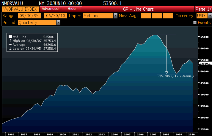
I tweaked Tom’s chart, and came up with this 20 year chart of the national net wealth in the USA. It is essentially Housing Equity + Stock market Value:
The value of US stock and housing equity fell 25.7% from the pre-crash peak (June 07) to the recent low — $65.8 trillion down to $48.8 trillion — a destruction of value of nearly $17 trillion dollars. Perhaps this explains some the negative sentiment . . .
>
Total Household Value
(Home Equity + Stock Value)

Bloomberg chart via Fusion Analytics Investment Partners, inspired by Econochat


What's been said:
Discussions found on the web: