There seems to be an increasing amount of rhetoric about government spending — how much of it there is, whether or not it’s affordable, the extent to which Obama is bankrupting the nation, that government spending is “crowding out” what the private sector might spend, etc., etc. So, does it wash?
Most readers will have already picked up on the fact that I’ve taken to using the “indexing” feature at FRED, as it allows for level-playing-field, apples-to-apples comparisons of various metrics over different time periods. For a variety of reasons, such comparisons are sometimes hard to make, but without them it is often difficult to contextualize data. A great introduction to indexing is provided here at the website of the Dallas Fed (Indexing 101, if you’ll pardon the bad joke).
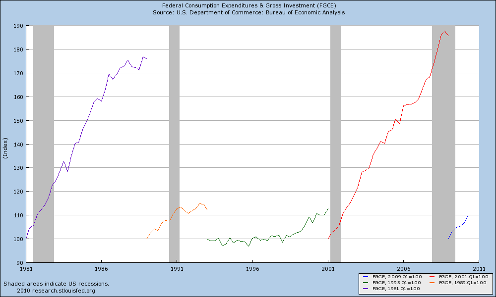
That said, exactly what has been going on with government spending over the last five presidencies (FGCE at FRED)?
(As always, click through for ginormous. Indexed periods are started at Q1 of each president’s term and run through Q1 of the following president’s term.)
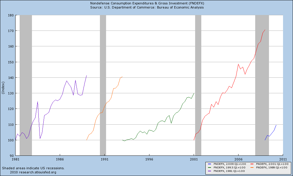
While the chart above provides the big picture (no pun intended) on federal spending, I know the immediate criticism will be that – for reasons that get far too political to discuss here – we need to strip out defense spending. Agreed. So let’s do exactly that, and revisit the chart looking at only nondefense spending (FNDEFX):
Not to leave anyone in suspense, here’s the scorecard five quarters from the inaugural quarter (i.e. 100 at inauguration through the sixth quarter of the presidency):
- Reagan — 100.9
- Bush Sr. — 115.6
- Clinton — 100.2
- Bush Jr. — 115.1
- Obama — 109.5
More on this file when we get the third quarter GDP numbers later this month, but it would appear the facts speak for themselves.


What's been said:
Discussions found on the web: