I have a few favorite Housing charts: Median Income to Median Home Price, Housing Value as % of GDP.
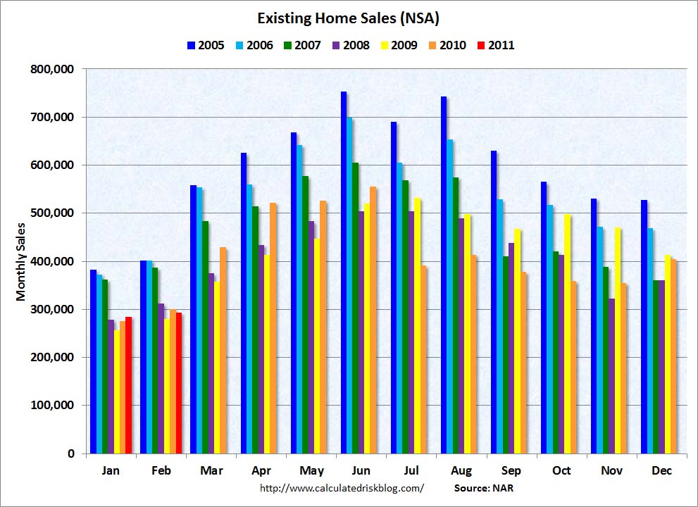
This one may very well be my favorite: Existing Home Sales NOT Seasonally Adjusted.
Why? A few reasons:
• It shows the seasonal rhythm of housing sales, ticking up each month from January forward, with an annual double top in May/July.
• Its relative — no matter how much the NAR data may be flawed, it is a consistent methodology. Thus, comparing the year-over-year numbers provides some insight into the Housing market.
• The impact of the government tax credit is obvious (see Yellow line); once that faded, prices faded as well.
Here is the chart:
>
click for ginormous chart

Chart courtesy of Calculated Risk
>
Sources:
February Existing-Home Sales Decline
NAR, March 21, 2011
http://www.realtor.org/press_room/news_releases/2011/03/feb_decline


What's been said:
Discussions found on the web: