All this week, we will be looking at the Housing Recovery meme, challenging the assumptions and data that make up that argument. Monday, we began with Debunking the Housing Recovery Story. Yesterday, we did a Reality Check on Home Affordability.
Today, we take a closer look at pricing — where we are, and how much lower we have to go.
~~~
According to the Case Shiller index of national prices, the median price of a home in the United States has fallen ~35% from peak price to trough. Very few folks had forecast this.1
Some regions that were excessively frothy during the boom — California, Las Vegas, South Florida and Arizona — have seen much greater price drops. Other areas had laws (Texas) or other financial conventions (New York City) that mandated significant down payments and other prudent requirements avoided much of the bloodshed. These regions did not see the same speculative silliness to the upside and hence have been spared the madness to the downside.
Where are we today? Where might prices go over the next few years? The conventional wisdom seems to be that prices have stabilized, and that we might scrape along the bottom for a few more quarters or even years. The data suggests something else.
Let’s begin with current prices: The most recent Case Shiller index of national prices (January 2012) reveals that prices are still falling, about 4% year over year. We can point to three favorable data points regarding home prices:
1. Prices are decelerating, falling more slowly than they had been circa 2007-10;
2. Prices are now back to where they were in 2003;
3. The median prices comparing Rentals vs. Home Purchases now slightly favor purchases.
These may not sound like terrific progress, but they are a marked improvement over what was taking place a mere three years ago. And while we still have government intervention in the form of Mortgage Mods (HAMP) and Foreclosure Abatements, we are no longer seeing distortions of First time buyer tax credits.
We will spend some time on the Psychology of Renting later this week (including Mortgage rates) but for now, let’s simply note that rental pricing has dramatically accelerated. As the chart (courtesy of Ned Davis Research) shows, costs of owning vs renting are now back to where they were in 1997, 1988 and 1976. The context is obviously very different today; However, this is the metric of choice to employ to show homes as not expensive:
>
Home Price Appreciation/Rent

Source: NDR.com
>
While rentals look less appealing as they go up in price, the other side of the equation is simple mean reversion. By most other metrics, home prices have almost but not quite fully mean reverted. That raises two important problems: Valuation and Post Bubble Pricing Behavior.
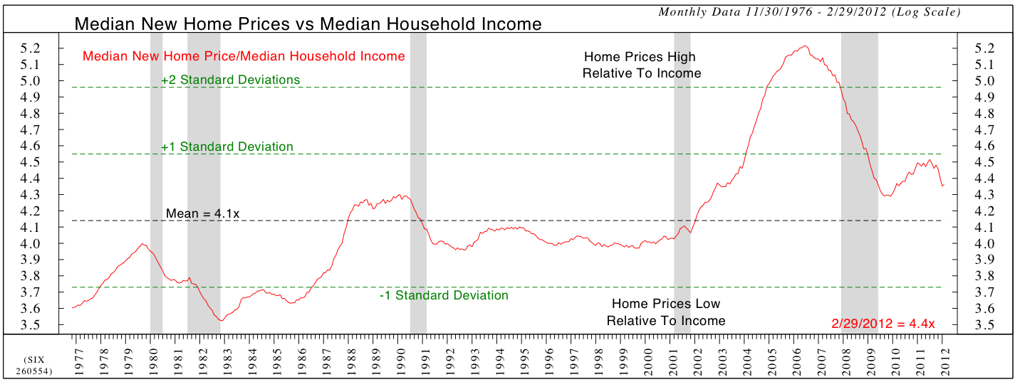
Yesterday, we discussed crucial purchase impediments such as having a 20% down payment, and qualifying for a mortgage. The next chart (again courtesy of Ned Davis Research) shows the historic relationship between median income and median purchase price. This is yet another crucial factor, as any buyer must earn sufficient income to service their mortgage obligations if they hope to keep the house.
And therein lies the rub: Real Incomes have been mostly flat the past decade; this is making it challenging to grow into a full blown housing recovery. Without real income growth, the purchasing power of potential buyers remains flat.
>
New Home Price/Median Household Income

Source: NDR.com
>
The relationship between income and purchase prices has been very stable. As the above chart reveals, home prices relative to income (and therefor purchasing ability) have come back down nearly to the way to the mean. That uptick that we see in 2009-10 was based on the First time buyer tax credit. Once that expired, the downward price action began anew.
By this very basic and traditional measure of home prices, we can determine that prices remain slightly elevated relative to where they have historically been. The variable is always mortgage rates, which we will address later this week as well. However, we must consider that the ZIRP policy of the Fed is keeping mortgage rates at unprecedentedly low levels. This helps explain most of the slowing of the mean reversion.
>
Post Bubble Pricing Behavior
There is one last factor that requires some discussion: How asset prices behave following a bubble.
Regardless of the asset class — stocks, bonds, commodities, homes, etc. — assets do not merely mean revert. We have never seen a stock market that has run up into bubble territory, and then merely reverted to fair value of a 15 P/E. Instead, we careen wildly past that level, to deeply undersold, and exceedingly single digit P/E cheap.
That is the marvelous mechanism of markets. It is how assets are repriced, distressed holdings liquidated, capital markets stabilized, fools revealed, speculators punished — and money finally returned to its rightful owner, the prudent investor.
To date, we have not fully mean reverted, much less fallen far below fair value. In order to form a lasting recovery, we need to see homes cheap enough that they fall into “good hands” — i.e., long term owners who can afford to make their monthly mortgage payments.
Until that happens, homes will continue stumbling along the bottom of the price range, with a negative bias to prices. Another 5-10% is a very easy downside target — assuming nothing else goes wrong . . .
~~~
Tomorrow: Foreclosures!
_______________
1. See Reinhard & Rogoff, January 2008, Ritholtz, May 2005).


What's been said:
Discussions found on the web: