@TBPInvictus
Friday’s BLS truther controversy was, in a word, sad. That folks now nonchalantly float claims that government agencies fudge numbers is (or should be) beyond the pale (just as it was in 1970 when Nixon did it). But it’s not. While the truther discussion has made its way into every nook and cranny of the interwebs, maybe it would be instructive to take a look at some anecdotal information that supports Friday’s allegedly contrived unemployment number.
Business Insider’s Joe Weisenthal suggested early Friday that the numbers we’d gotten earlier last week on auto sales foretold a decent jobs/unemployment number, which sent me scurrying to FRED to produce a chart:
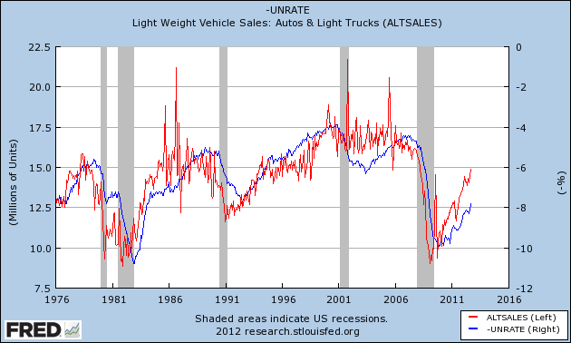
(Note: Unemployment Rate is inverted to better show correlation. Chart is current through Friday’s release)
The pattern of auto sales leading the unemployment rate is crystal clear. Great call, Joe. So, the same folks who are skeptical of the BLS must necessarily also question the sales reports of GM, Ford, Toyota, Honda, BMW, and every other car manufacturer that reports monthly sales figures (i.e. all of them).
Another piece of anecdotal information that I’ve used for years now is the NFIB’s “Poor Sales” (as Single Biggest Problem) vs. the Unemployment Rate:
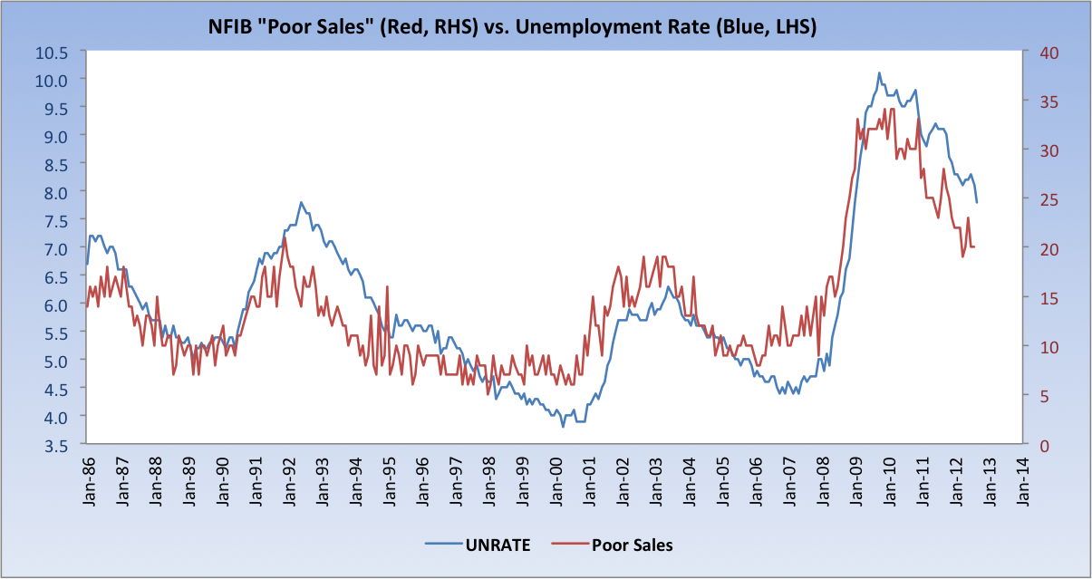
As of the NFIB’s most recent report, Poor Sales was cited by 20 percent of businesses as their Single Biggest Problem in their Small Business Economic Trends report.
Finally, the BLS itself goes to great pains to be transparent, and does a good job doing so. Earlier this year, their Editor’s Desk column ran a piece titled Employment Trends From Two Surveys, which very broadly discussed the two surveys from which jobs data is compiled.
Separately, and almost certainly unknown to Mr. Welch, the BLS issues a technical document every month that address the trends in both surveys. That document can be found here, and contains the following chart:
Among the objectives of the monthly analysis is to produce an Adjusted Household Survey (seen above). BLS:
This [Adjusted Household Survey] is a research series created from household survey employment to be more similar in concept and definition to payroll survey employment. Household survey employment is adjusted by subtracting agriculture and related employment, nonagricultural self employed, unpaid family workers, private household workers, and workers absent without pay from their jobs, and then adding nonagricultural wage and salary multiple jobholders. The effects of population control revisions also have been smoothed out in the historical data in this series.
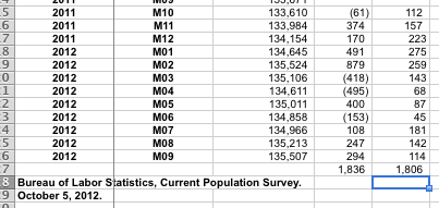
But you knew that, right, Jack? The Adjusted Household Survey shows that 1.836MM jobs have been created over the past 12 months. The Payroll Survey? 1.806MM. The difference between the two over the course of a year? A paltry 30,000 (see Page 1 of the PDF, numbers below). While there may occasionally be wide month-to-month swings (and the Household Survey is known to be the more volatile of the two), the two series generally track fairly closely over time, which is how data should generally be observed.
And where were the conspiracy theorists earlier this year when the Adjusted Household Survey was flagging 400k+ job losses? Nowhere, that’s where.
Source: BLS, Adjusted Household Survey Level (Column 3), MoM Adjusted Household Survey Change (Column 4), MoM Nonfarm Payroll Survey Change (Column 5)
The notion that career BLS economists, statisticians, and staffers were collectively in the tank to produce a result designed to influence the election is absurd on its face. It’s a waste of everyone’s time to discuss and debate this. I’ve seen no one make a claim that this has been a robust recovery; it has not been, and it continues to be tepid. That said, we should be channeling our efforts on how to make it better and not making idiotic and irresponsible claims that there’s widespread data book-cooking going on.
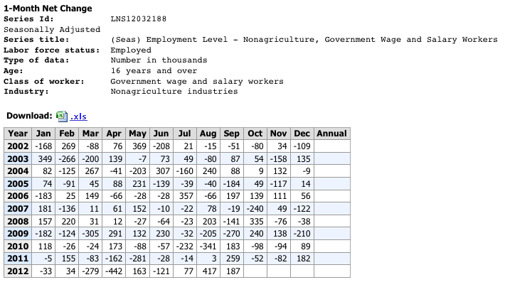
Lastly, I’ll confess, too, that I’m having a bit of difficulty confirming Mr. Welch’s oft-repeated claim that we added 600,000 government sector jobs in the past two months. Can anyone help me out here, or was that also pulled from somewhere within his bowels? I’m always open to the possibility that I’ve overlooked something, and if that’s the case, I’d love to see what it was – I can find no evidence that the government added 600k jobs in the past two months.
Adding: Thanks to Jeff in Indy for the link to Mish, who points to Table A-8 (Household Data) of the release for data on the 600k bump in government employees:
Now, what’s above is Seasonally Adjusted, so seasonality is out of the picture here. That said, there are clearly outliers in this series fairly often (Jan 2003 jumps right out at me, as does April 2012’s -442. And there’s no readily apparent pattern that I can discern). Again, I would stress that data of this type needs to be observed over time – it’s typically not instructive to draw inferences from one or two months’ prints.
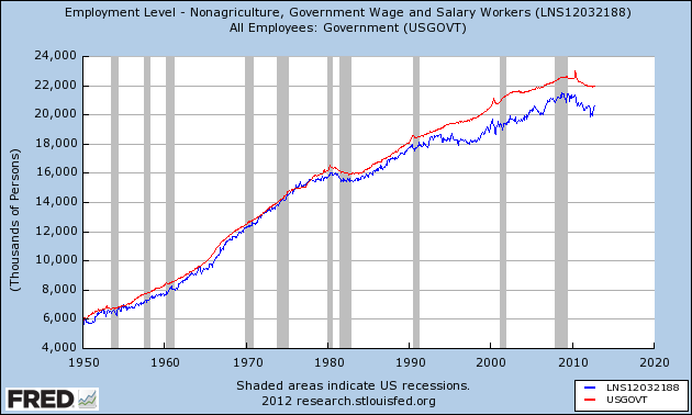
Here are the Establishment and Household surveys on Government Employees over time. As a fellow (fairly prominent) econ blogger just emailed me: “Nobody would use the household survey to track the number of government employees.” Indeed, and I don’t know anyone who has (which is why I was at a loss as to what Welch was talking about). That said, I’ll be inquiring as to the gap that opened – and persisted – since the early 90s.



What's been said:
Discussions found on the web: