
Sooner or later most car drivers have this experience. You’re driving on the freeway, listening to some good music, the sun is shining, and you decide to switch lanes. You check the rear view mirror, note everything looks clear, turn on your right blinker, and begin to ease into the lane on your right. Suddenly this smooth process is interrupted by the sound of someone laying on their horn. You check the rear view mirror, see the car you’re about to collide with, wonder where it came from, and promptly move back into your original lane. If you’re lucky, you’ll also see the other driver gesture their appreciation of your driving skills. After regaining your composure after the close call, you realize the car you didn’t see must have been in your blind spot.
At important tops and bottoms in the stock market, many investors are impacted by their blind spot and it often costs them dearly. By their nature, markets are forward looking and discount the future, and if one listens closely, the message of the market can be discerned. As such, markets anticipate changes in the economy, whether it is the changing level of interest rates, stock prices, home values, gold, oil, copper, or any asset whose price is determined by supply and demand. The opinion that the markets are a discounting mechanism is expressed almost daily on CNBC or Bloomberg and in financial publications. For the most part, the direction of any market is aligned with the views of participants. If the ‘news’ is negative, most investors will be inclined to sell and the market will be in a declining phase. When investors are positive and supported by good ‘news’, there will be more buyers than sellers and the market will be in an uptrend. This process may seem elementary and obvious and it is. The process that creates the blind spot is reinforced by three factors – fundamentals, time, and human nature.
At the beginning of a new trend there will be some fundamental basis that justifies the reason to become positive or negative. Over time, more market participants will agree with the fundamental reasons supporting the trend, and will take the appropriate action – buying if the fundamental reason is positive or selling if the fundamentals are poor. The market responds to the increase of buying or selling, forcing more investors to take action, which further reinforces the trend. Humans project the recent past into the future, which means investors have a tendency to invest looking through the rear view mirror. If the stock market has been trending higher for an extended period, investors know most of the reasons why the market has been going up and expect the trend will remain their friend. Investors are repeatedly advised by the financial press and advisors that it is a mistake to sell, so they resist the urge to sell even as the stock market is falling. When the pain from a steep decline becomes too great and they simply can’t take it anymore, they frequently throw the in towel not far from a bottom. Investing through the rear view mirror is why so many investors buy near a market high, and sell at market lows.
The notion that the stock market is a discounting mechanism that anticipates changes in the economy is part of Wall Street folklore and is widely accepted. It is logical, easy to understand and works most of the time, which creates the blind spot. But here’s the rub. At every major top and bottom in the stock market, the market is wrong. We appreciate that this view borders on heresy, but a quick review of history should prove the point. The advent of the internet in the early 1990’s brought about a technological boom that boosted productivity. After almost a decade of gains, the ‘New Paradigm’ resulted in extraordinary valuations, but that didn’t inhibit investors from flooding technology mutual funds with money. In March 2000 when the Nasdaq Composite was above 5,000, what was the market discounting and ‘telling’ technology investors? Don’t worry, be happy, tech stocks are still going higher! The bull market that began in March 2003 was more than four years old when the first rumblings of the credit crisis appeared in August 2007. After the Federal Reserve cut the federal funds rate several times, and Fed Chairman, Ben Bernanke, said housing would stabilize by the end of 2007, the stock market rallied to a new all-time high in October 2007. Clearly, the stock market was telling
investors that a potential credit crisis was a non-event. Wrong. By December 2008, the Federal Reserve had slashed the Federal funds rate to .25%, but the economy and stock market remained in free fall in early 2009. Certainly, the stock market was confirming that the sky was indeed falling.
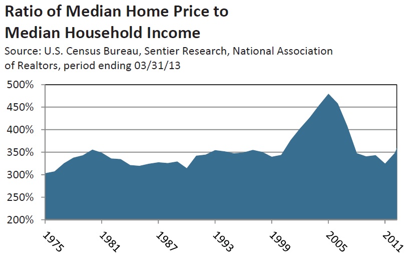
What is amazing is that investment professionals are just as likely to develop a blind spot as the retail investor who follows market movements only part time. It’s possible that professionals are more likely to believe that markets truly are a discounting mechanism since they know all the reasons why the current trend is happening. For instance, it is the responsibility of the rating agencies to rate and measure the amount of risk in the securities related to housing. Moodys, Standard & Poors, and Fitch Ratings all used sophisticated methodologies to evaluate mortgages, mortgage back securities, and all the derivatives they routinely rate AAA. Amazingly, the analytics used by the rating agencies presumed home prices would not decline, since they had not fallen since the 1930’s. Between 1965 and 2000, the ratio of home prices to median income remained remarkably stable, fluctuating near 3.3 to 1. This was the result of mortgage lenders not allowing the monthly mortgage payment of a home buyer to exceed 33% of income. As shown in the Radio of Median Home Price to Median Household Income chart above, by 2006, the ratio of home prices to median income had risen from 3.3 to 1, to 4.7 to 1. And yet, the rating agencies believed the risk of a decline in home prices was still 0%. In our opinion, the stock market and markets in general are almost always wrong at every major top or bottom. Despite the history and facts, the belief that the stock market is a discounting mechanism continues. In recent weeks the common theme on CNBC, Bloomberg and in the financial press is the recent strength in stock market is telling us the U.S. economy is in good shape. The expected pick up in GDP and earnings in the second half is why investors should buy if the market dips. As we noted last month, there are a number of reasons why a second half improvement is unlikely. Investors’ faith that the market is a discounting mechanism may be creating another blind spot if the economy fails to accelerate as forecast.
Last year Gross Domestic Products (GDP) grew 1.7%, and that was with an improving housing market and increase in auto sales. Even if they continue to improve, the incremental addition to GDP will be small, and not likely to offset the impact of the tax increases and sequester. The Congressional Budget Office has estimated that the combined drag from the tax increases and sequester will amount to 1.75% of GDP. Our view has been that the impact from the increases in taxes and sequester was likely to be cumulative. The 2% social security payroll tax is about $20 a week for a worker with median income of $50,000. We doubted most consumers would respond with spending reductions after they received their first paycheck in January. Instead, many consumers would maintain their life style for a period by charging a bit more and dipping into savings. The cuts implemented by sequester are likely to take some time as they ripple through the economy, as down steam suppliers are
increasingly affected. This suggests the drag from the tax increases and sequester are likely to intensify in the second half of this year.
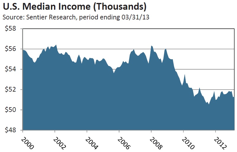
Consumer spending represents 70% of GDP and the overall financial health of many consumers has gradually deteriorated during the last two years. Wages grew just 2% on average in 2011 and 2012, less than the increase in the cost of living. Real per capita disposable income has shrunk by 0.4% at an annualized rate over the past five years. That is the worst reading since this data series began in 1964, according to the Bureau of Economic Analysis. Since 2002 median income has declined 9.1%, falling from $56,438 to $51,320 in March 2013. According to Sentier Research, since the recovery began in June 2009, disposable income has fallen from $54,275 to $51,320, a drop of 5.4%, which only reinforces how subpar this recovery has been.
Only 88,000 jobs were created in March, which was far below the gain of 268,000 in February. We suspect the March report overstated the degree of weakness, which implies a better number is likely when the figures for April are reported in early May. That said there was not much to like in the March report. Nearly 500,000
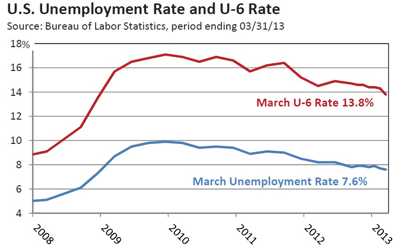
Americans dropped out of the labor force, the biggest one-month decline since December 2009. The participation rate measures the number of people who are working or looking for work. In March the participation rate fell to 63.3%, the lowest since 1979. There is no question that demographics are playing a role as out-of-work baby boomers choose to retire. However, this only explains about 60% of the decline in the participation rate. The participation rate for workers 25-54, considered prime-age-workers, was 81.3% in March, the lowest since 1984. When the recession began in January 2008, the participation rate for those under 25 was 60%, but was down to 55% in March. There are a lot of college graduates who have a diploma, an average of $25,000 in student loans, and are working at Starbucks. According to MFR, Inc., the unemployment rate would be over 11%, if the participation rate was at its 2007 level of 66%. There are 7.6 million workers who are working part time, but want a full-time job. The U-6 rate was 13.8% in March, which includes those seeking a full time job and those who have given up looking. The labor market continues to grow at a rate that is not likely to boost wage growth or bring the level of underemployment and unemployment down in a meaningful way in coming months. This suggests the odds do not favor a significant improvement in consumer spending before year end.
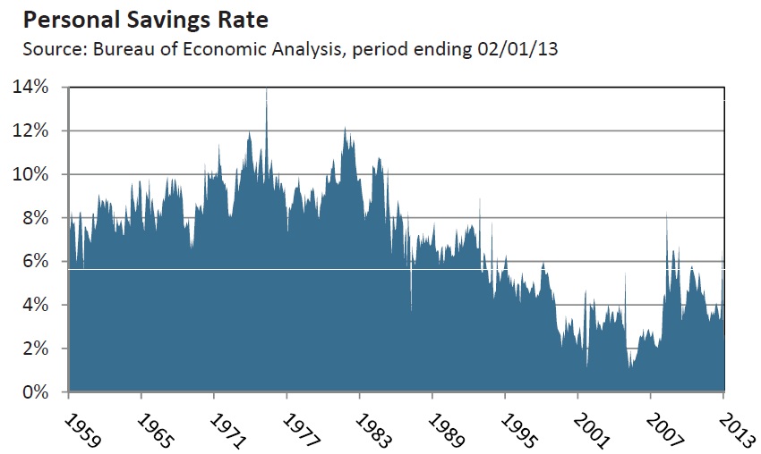
The American consumer has often been considered a spendthrift, but that has not always been the case. Between 1958 and 1988, the average savings rate was over 8%. Despite the roaring bull market of the 1990’s and the housing boom until 2007, the average savings rate declined until it was below 2.0% in 2006. In the first quarter of 2011, the savings rate had improved to 5.4%. In another reflection of weak income and job growth over the last two years, the savings rate fell to 2.6% in February. Consumers have been dipping into their savings since early 2011, which could make it difficult for savings to support an increase in spending in the second half of 2013.
Message to U.S Economy: Don’t Fight the Fed!
The Federal Reserve (Fed) has held the Federal funds rate just above 0% since late 2008, and initiated three rounds of Quantitative Easing (QE) over the last 5 years in an attempt to ignite a self sustaining recovery. Despite unprecedented monetary accommodation this recovery has been far weaker than the average of the 10 post World War II recoveries. Clearly the economy is fighting the Fed. The lack of a stronger economic response to the Fed’s efforts introduces an interesting topic for debate.
As far as Wall Street folklore goes, ‘Don’t fight the Fed’ may be the most accepted piece of Wall Street wisdom, popularized by Marty Zweig in his 1986 book “Winning on Wall Street”. Historically, there is no question that monetary policy has had a significant effect on the stock market over the last 60 years. The stock market has usually begun a new bull market after the Fed lowered rates, often gaining 30% to 50% in the first year. More importantly, monetary policy has been the most effective policy tool in managing the economy. In times of strong growth and rising inflation, the Fed has raised rates to slow the economy and bring inflation down. To lift the economy out of recession and spur growth, the Fed has lowered rates. For most of the past 60 years, the economy has responded within 6 months or so whenever the Fed has either eased or tightened policy.
The legitimacy of ‘Don’t fight the Fed’ has been a strong rebound in the economy which validated the run up in stock values. We are concerned that investors are too focused on the positive impact of QE3 on stock prices and are overlooking how important it is that equity valuations be validated by the economy. A quick review of how effective monetary policy has been in managing the economy since 1954 will reveal that monetary policy has indeed lost some of its economic Mojo.
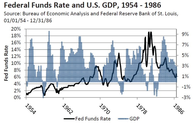
We will divide the period from 1954 to 2013 into two charts. Recessions or periods of pronounced slowing in GDP growth occurred in 1954, 1958, 1961, 1969-1970, 1973-1974, 1980, and 1982 were all preceded by a significant increase in the federal funds rate. Higher interest rates weighed on housing and auto sales, since
they are the most sensitive to the higher cost of financing. Once tighter credit and higher rates caused a recession to develop, the Federal Reserve lowered interest rates. The decline in the cost of financing unleashed pent up demand for home and auto purchases, resulting in a strong rebound in GDP growth. GDP jumped to at least 6% in at least one quarter during the initial phase of each recovery. In a number of instances, GDP growth exceeded 8%. The strong rebound allowed all the jobs lost during the prior recession to be recovered within 24 months.
In 1981, the federal funds rate peaked just below 20%, which broke the back of inflation and ushered in an extended period of disinflation. GDP growth exceeded 7% in 1983, but each subsequent recovery has been progressively weaker, even though interest rates have steadily declined. Each period of slowing or recession since 1981 has followed only modest increases in the federal funds rate. The economy has been less capable of handling even a modest increase in the cost of financing and required an ever larger dose of monetary accommodation. Between 2001 and 2003, the Federal Reserve was forced to push the real federal funds rate into negative territory for the first time ever. GDP growth didn’t exceed 2% until the tax cut in the spring of 2003 provided the spark the economy needed to lift GDP above 4.0% in early 2004. Although the Fed increased the federal funds rate from 1.0% in mid 2004 to 5.25% in 2006, the Federal Reserve never really tightened policy. The availability of money for mortgages was plentiful, and credit spreads continued to narrow until mid 2007.
Since the financial crisis in 2008 the connectedness between monetary policy and the economy has clearly further diminished. The Fed’s most powerful tool has always been raising and lowering interest rates. Since 2008, the Fed has kept the federal funds rate just above 0%, which means real rates have been negative
for 5 years. When this failed to stabilize the economy in 2008, the Federal Reserve was forced to implement a non-traditional monetary tool in the form of Quantitative Easing. The goal of this extreme measure was to establish a self sustaining recovery. When Quantitative Easing didn’t get the job done, and GDP growth began
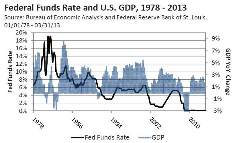
to slow in 2010, the Fed launched round two of quantitative easing, which required the label QE2. As the European sovereign debt crisis erupted the Fed launched QE3, and then expanded QE3 from $45 billion of monthly bond purchases to $85 billion to offset the expected drag from a tightening of fiscal policy in 2013. Monetary policy has been pushed into uncharted territory and still a self sustaining recovery is not in place.
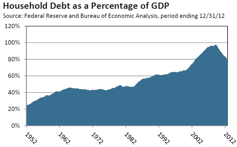
A review of household debt may shed some light on why monetary policy had so much economic traction from 1950’s until 2000. In the early 1950’s household debt as a percent of GDP was less than 25% of GDP. By the mid 1960’s it had risen to the low 40%’s range which lasted until the early 1980’s. It then began a gradual climb
and by 2000 household debt was 66% of GDP, before soaring to 98% of GDP in 2007. One of the primary drivers of the surge in household debt was the decline in interest rates after 1981. Most consumers determine what they can afford to buy based on the monthly payment. As the cost of money fell they were able to carry more debt, which is why household debt soared from 44% of GDP in 1982 to 98% in 2007. The accumulation of debt was also made possible by the huge run up in home values and a significant decline in lending standards between 2000 and 2007. Since 2008 home prices have dropped by 30% and banks have raised lending
standards, which has effectively neutralized much of the benefit the economy received whenever the Fed has lowered interest rates. Household debt has fallen from 98% of GDP to 81%, but more than half of the improvement was the result of consumers defaulting on mortgages, auto loans, and credit card debt. As noted previously, income growth has been less than the cost of living in recent years and the personal savings rate is less than one-third of what it averaged between 1958 and 1987. We think the household debt to GDP ratio will need to drop to 65% of GDP, and the savings rate will need to climb above 7% before a lasting self sustaining recovery can take hold. This is likely to require at least several more years since income growth is so feeble.
The pattern seen in household debt is also very apparent in Total Credit Market Debt (TCMD) as a percent of GDP. Between 1946 and 1980 it remained remarkably stable, and in 1982 TCMD was $1.65 for every $1.00 of GDP. By 2007, it had risen to $3.70 of debt for each $1.00 of GDP. This is clearly the elephant in the room. The Federal Reserve has been fighting deflation since the financial crisis, since a pronounced and prolonged decline in GDP would make it
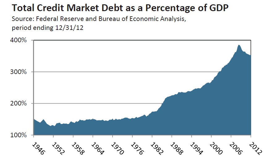
increasingly difficult for borrowers to service their debt. It is also why the budget deficits were necessary to keep aggregate demand from plunging and tipping us into a deflationary spiral. The risk of deflation has lessened, but it is still the greatest risk our economy faces. This is why too much austerity in the short run could become problematic and why the Fed has taken out an insurance policy by expanding QE3.
In the movie Apollo 13, the astronauts had one chance and a small window if they were to successfully return to earth. If they came in too shallow their capsule would bounce off the atmosphere. The Federal Reserve has one chance to get the unwinding of QE3 right and begin the process of normalizing monetary policy. We believe the Fed will wait until they see the full impact of the tax increases and sequester, which are projected to cut 1.75% from GDP growth over the next year. Health care represents 15% of GDP, so the implementation of the Affordable Care Act in 2014 has the potential to be disruptive not just for the labor market but for the economy as a whole. More than anything, the Fed will want solid proof the economy has achieved a self sustaining growth path before they begin to scale back QE3, so they will err on the side of caution. We think QE3 will be maintained through the end of 2013.
Stocks
The stock market has responded to QE3 with a very strong rally since last November. The announcement by the Bank of Japan that it will double its monetary base over the next two years to reverse the grip of deflation that has depressed the Japanese economy for most of the past 17 years has made investors more optimistic.
Investors have revised the old adage of ‘Don’t fight the Fed’ to ‘Don’t fight the Fed, ECB, and Bank of Japan’. In the latest Barron’s Big Money Poll, 74% of the money managers who responded described themselves as bullish or very bullish for the balance of 2013. This is the highest percent of bulls since Barron’s began doing its Big Money Poll 20 years ago. Over the next twelve months, 86% are optimistic, while 94% think the next five years will be good. For perspective, only 54% of money managers were bullish as the market was forming its top in 2000. As we have often stated, markets don’t top because there are too many bulls. Markets top when investors are given a reason to sell. Since the consensus is for earnings and the economy to accelerate in the second half of 2013, investors may be disappointed if the economy fails to pick up
speed by year end as we expect. Beyond the belief QE3 effectively immunizes the stock market from a decline, money managers also believe bonds are unattractive and the U.S. looks good when compared to most markets around the world. This theme has gained enough traction to acquire an acronym – TINA –there is no alternative. This has a familiar ring to it, i.e. technology stocks as the New Paradigm in 2000 and in 2006 the belief that home prices could only go up.
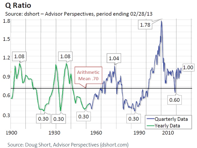
While monetary policy is boosting the stock market, the economy isn’t responding as it has in the past. This creates a potential risk for the stock market should valuations get too stretched. Most analysts cite the standard price earnings ratio as indicating the stock market is fairly valued since the current P/E is about 15. Since we live in extraordinary times we’re not sure a standard measure of valuation is entirely appropriate. The Q-ratio was developed by Nobel Laureate James Tobin in 1968. The Q-ratio is the total price of the stock market divided by the replacement cost of all its companies. The average since 1900 has been 0.7 and readings above 1.00 have been rare and significant: 1906 1.08 – 1929 1.06 – 1938 1.08 – 1968 1.04 – 2000 1.78, September 30, 2012 1.00. The S&P has rallied more than 9% since the end of the third quarter, and the Vanguard Total Market index is up 10.2%. This suggests the Q ratio is likely nearing prior market peaks, with the exception of the 2000 dot-com bubble market.
Technically, the S&P 500 is testing an important trend line which connects the highs in 2000 and 2007. The overall formation since 1999 is potentially a broadening top which looks like a megaphone. It is certainly possible that QE3 will enable the S&P to break out above 1,600, which could lead to a blow off that carries the S&P to 1,680 – 1,700. Since we think the Fed will maintain QE3 for the rest of this year, the bullish psychology surrounding QE3 makes this a real possibility. But a significant rise from here will only widen the divergence between the market’s valuation and the performance of the economy, at a time when faith in the Federal Reserve has never been higher. This increases the risk that ‘Don’t fight the Fed’ could become the ultimate blind spot.
We noted last month that a 5 step rally in the S&P 500 from the November low was nearing an end, which suggested that the market was within 1%-2% of an intermediate high. On April 11, the S&P made an intra-day high of 1597.35. A decline below 1,536 would increase the odds that the April 11 high did mark an intermediate high. That said any correction is likely to find support near 1,485 – 1,510, since investors have few reasons to sell and are looking to buy the dips. The market could be more vulnerable during the second half of this year if the anticipated acceleration fails to materialize. Since the low in March 2009, every intermediate low has been higher, so any decline below 1,485 would be an important negative and increase the odds that the S&P had made a triple top on April 11.
Eurozone
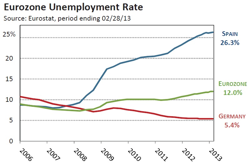
Our view has been that the recession in the Eurozone is likely to persist well into 2013, and recent data points support this outlook. According to Eurostat, unemployment in the Eurozone rose to more than 19 million in February, which kept the unemployment rate at a record 12.0%. Job losses have persisted for 16 consecutive months. European car sales contracted for the 18th consecutive month in March and were down 10.2% from year ago levels, according to the European Automobile Manufacturers Association. The first quarter results were the worst start to a year since 1990 when comparable data were available. Germany is the largest country in the EU and considered the economic anchor. Car sales fell 17.1% in March, and according to ZEW research economic sentiment also declined sharply in March.
Markit’s manufacturing purchasing managers index fell to 46.5 in April. In addition, the new orders index fell to 44.9 from 45.3 in March. The weakness in new orders suggests there will be little improvement in coming months and higher rates of unemployment are likely in many of the Eurozone countries. We expect the ECB to cut rates from .75% to .5% in coming months. The challenge for the ECB is not the cost of money, but how to get banks to lend to small businesses during a recession. This is critical since European banks provide 80% of credit and are the lifeblood of small and medium size business throughout the 27 nations in the EU.
We think the decision in Cyprus to allow holders of senior bank bonds to absorb losses and hit those with more than $100,000 Euros on deposit with a 40% tax will have negative ramifications should the crisis flare again in Italy, Spain, or France. At the first sign of trouble holders of bank debt will be reluctant to roll over their bonds or demand a higher return. This could exacerbate a short term liquidity problem or at a minimum increase the banks funding costs. Wealthy depositors will also be more inclined to pull their money from any suspect bank which could ignite a run on deposits. The decision to make bond holders and depositors pay for a bailout rather than tax payers was a watershed event.
GOLD and GOLD STOCKS
In our January commentary, we discussed the potential that gold had been consolidating its significant rally from $700 in 2008 to its peak at $1,920 in September 2011. Technically, we thought gold had been tracing out a triangle, and might dip one more time to $1,525-$1,550 to complete the triangle. Last month we emphasized that gold must hold above $1,480- $1,500 on a closing basis to keep the triangle pattern intact, and noted that a decline below this support area would be a long term negative.
We also noted that gold stocks were historically cheap relative to the price of gold based on the ratio of the gold stock index (XAU) to gold. From 1998 until the financial crisis in 2008, the ratio fluctuated in a range of 3.6 to 5.3. In early March, the Gold/XAU ratio climbed above 12, indicating that gold stocks were the cheapest they had been relative to gold in the last 25 years. We cautioned that gold stocks were inherently volatile, so they were not appropriate for many investors, no matter how cheap they appear. And if gold dropped below $1,480-$1,500, we thought the gold stocks could decline materially, so risk management was essential.
We expected there to be stops under gold below $1,525 which is why we thought it critical that gold hold above $1,480 and that any decline be reversed quickly. Needless to say, once gold broke below $1,525 there was an avalanche of selling. This is an excellent example of being wrong but how good risk management can limit the loss.
Although the decline damaged the longer term outlook for gold, it is so over sold that a good rally is likely in coming months. Gold stocks relative to gold have become even cheaper, with the XAU/gold ratio climbing to over 13. We would like to see the relative strength of the gold stocks improve before looking for another entry point.
Source:
Jim Welsh, David Martin, Jim O’Donnell
Macro Strategy Team

What's been said:
Discussions found on the web: