
Earlier this week, Felix Salmon did a sensible thing. Instead of fulminating against the rising prices of the art market and declaring it a bubble that must necessarily burst, he asked the good people at Artnet—the very folks who brought price transparency to the art market—to produce a chart for him of 25 top artists he selected and their overall auction sales from 1988 to present.
What he discovered in this self-described “unscientific” exercise is that the the market for those particular artists, when adjusted for inflation, remains lower than either the 1989 peak or even the 2007 peak that followed.
A good sport, Salmon concluded that the inevitable art market crash may not be imminent even if it remained certain. This little inquiry was good as far as it went but it didn’t really go far enough. In the first instance, the art market is always a bubble if your definition of a bubble is when assets trade for exchange values disconnected from their economic value. Since art has no economic value, the art market is always and ever a bubble.
If scare words are useful, we might as well call the art market what it is, a pyramid scheme. Art is only valuable if there are two more people coming after you who want to buy it for more than you paid, inflation or no. Why is that worth saying? Because it raises another way to look at the art market in terms of overall spending on works of art.
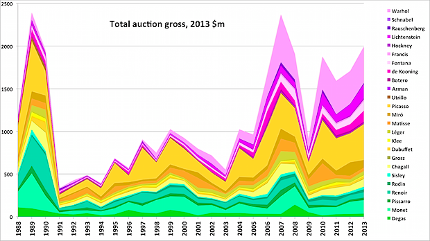
Katherine Markley, the high priestess of Artnet’s data created a chart of Artnet’s gross auction data over the past quarter century. Remembering that the numbers grow not only with the volume of dollars spent upon art but with the number of auction houses from which Artnet collects data, here is a chart of gross recorded sales that we’ve adjusted for inflation (so any errors are my own.)

It’s easy to see that after a long fallow period, the market began to advance in 2006. Then, it barely looked back. See that dip in 2009, it is nearly the same inflation-adjusted level as 1990. Again, that’s probably because Artnet covered many more auction houses by 2009 than it had in 1990 and those global auction houses were seeing more money spent on art, even in the midst of a credit crisis.
That spike in 2011? It’s the Chinese auction houses going through the roof. We’re now all aware that good number of those reported sales were never, in fact, completed. Nonetheless, the chart seems to support the idea that more buyers are coming in behind those who entered the market in the last generation. Demand would seem to be continuing to grow. That offers a counter-theory of the art market: growing global wealth is going into art and artifacts that were previously not valued monetarily.
Another way to look at what’s being spent on art is to see what’s happening to average prices. This is a very raw measure that we asked Artnet to provide, simply divide the total dollar volume by the total number of lots. It won’t tell you a lot but it does give a sense of whether the growth in auction volume is a product of excess liquidity—in which case, a stable number of items would become increasingly valuable (not unlike gold)—or whether the growth is the result of shift toward placing greater value on cultural objects.
The average price chart, adjusted for inflation, suggests the latter. After the crash of the 1989-90 peak, average lot prices stabilized. They rose again as the latest art boom took off but seem to be reverting to a new mean for this era’s art market. Even this year’s exceedingly strong numbers don’t pull the average price out of register. The chart doesn’t show it but the $45k figure would only raise the graph back to 2011’s not-too-scary levels.
Are art prices very strong? Yes. Could they be too strong and indicated a pull-back in the market? Sure. In fact, many in the market would like to see that happen for a number of reasons. The art market could crash next year as the gold market has this year. But it doesn’t look to be in a crazy pattern reminiscent of the worst years in 1989-90.


What's been said:
Discussions found on the web: