
Source: National Employment Law Project
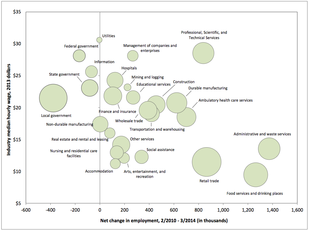
I really like this bubble chart. I saw it last night in a report from the National Employment Law Project titled: “The Low-Wage Recovery: Industry Employment and Wages Four Years into the Recovery.”
Interestingly, the data has provoked opposing reactions from two media outlets. The Washington Post’s Wonkblog used the chart in a piece with the headline: “U.S. job growth is coming in all the wrong places.” The New York Times’ Upshot went in the opposite direction: “A Low-Wage Recovery? The Evidence Isn’t There.”
I see two things in the chart: The largest numbers of new jobs are coming from low-wage industries (the chart doesn’t inform us as to whether this is unusual based on prior recoveries and/or expansions).
Second, federal, state and local governments are still a net negative on employment — which is very different from past recoveries.

What's been said:
Discussions found on the web: