
Which Poor Neighborhoods Experienced Income Growth in Recent Decades?
Dionissi Aliprantis, Kyle Fee, and Nelson Oliver
Department of the Federal Reserve Bank of Cleveland 04.09.14
Why has average income grown in some poor neighborhoods over the past 30 years and not in others? We explore that question and find that low-income neighborhoods that experienced large improvements in income over the past three decades tended to be located in large, densely populated metro areas that grew in income and population. Residential sorting—changes in population and demographics within neighborhoods—could help to explain this relationship.
We contribute to the broad body of research on poverty by looking into why income grew in some poor neighborhoods over the past 30 years and why it did not in others. Just as the poverty of an individual is defined in terms of the income, size, and composition of their family, a family’s poverty could be influenced by the characteristics of its environment. We might expect that the poverty of a neighborhood is influenced by its broader environment in much this same way.
We find that poor neighborhoods are more likely to have experienced significant income growth if they are located in growing metropolitan areas, which tend to be large and densely populated. Another key factor appears to be whether a neighborhood undergoes residential sorting, that is, when it experiences changes in population and demographic characteristics. Another notable change in a number of the poor neighborhoods we studied that experienced large growth in incomes was population growth, especially of Hispanic residents.
Low-Income Neighborhoods in 1980
Our analysis consists of identifying which neighborhoods were low-income in 1980, measuring how much their income had grown by 2008, and analyzing a number of variables to see which characteristics of the neighborhoods in 1980 might explain the changes observed in 2008. We focus our analysis on neighborhoods in the 100 largest metropolitan statistical areas (MSAs) of the United States by population as of 1980. We define low-income neighborhoods as those in the lowest fourth, or quartile, of the national distribution of neighborhoods’ average household income in 1980. We use Census data for information about the economic and social indicators in these neighborhoods between 1980 and 2008.(1,2)
In 1980, the average household income of all low-income neighborhoods was $30,394 (in inflation-adjusted 2009 dollars), compared to $59,672 for all other neighborhoods.(3) (See table 1.) As might be expected, low-income neighborhoods also tended to be less educated, in terms of both college and high school completion, and to have higher incidences of poverty and unemployment. And, consistent with anecdotal evidence, low-income neighborhoods were typically much closer to their metro areas’ central business districts (CBDs) and were much more densely populated than other neighborhoods.
Table 1. Low-income Neighborhoods Differed in Many Ways from Other Neighborhoods
| Neighborhood characteristic, 1980 | Low-income neighborhoods | All other neighborhoods | Difference |
| Average household income (inflation-adjusted 2009 dollars) | 30,394 | 59,672 | −29,278 |
| Share with a bachelor’s degree, percent | 9.1 | 21.1 | −12.0 |
| Share with a high school diploma, percent | 50.5 | 74.7 | −24.2 |
| Poverty rate, percent | 26.1 | 6.9 | 19.2 |
| Unemployment rate, percent | 10.8 | 5.2 | 5.6 |
| Distance from central business district (miles) | 6.8 | 11.5 | −4.7 |
| Density (residents per square mile) | 20,645 | 7,417 | 13,228 |
Note: Low-income neighborhoods are those in the lowest quartile of the national distribution of neighborhood average household income in 1980. Sources: Census Bureau; authors’ calculations.
How Have Low-Income Neighborhoods Fared since 1980?
While it is possible for all neighborhoods to grow richer or poorer, the rule tends to be one of persistence. Neighborhoods that were low-income in 1980 tend to still be low-income in 2008 (figure 1).
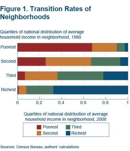
Of neighborhoods in the bottom fourth of the country’s income distribution in 1980, 67 percent were still in the bottom fourth by 2008. Only 23 percent made it to the second quartile, and an even smaller 7 percent and 3 percent, respectively, made it to the third and fourth quartiles of the country’s income distribution.
Similarly, the highest-income neighborhoods in 1980 were likely to remain high-income in 2008.(4) These results are not entirely surprising, because a location’s housing stock and many of its amenities are likely to hold relatively steady over time.
Relative to other neighborhoods, the average low-income neighborhood experienced less progress on a number of economic and social indicators between 1980 and 2008 (table 2).
- Average household income grew much more slowly.
- The gap in bachelor’s degree attainment rates widened (although the gap in high school graduation rates narrowed).
- Population levels and population density declined.
Progress on other indicators seemed better, but on these other indicators low-income neighborhoods had more ground to cover. Poverty rates, for example, rose less in low-income neighborhoods than in the middle- and higher-income neighborhoods, but starting levels were much higher. Likewise, unemployment increased as much as in other neighborhoods, but it started out at a much higher level.
Table 2. Low-Income Neighborhoods Saw Less Growth on Many Dimensions
| Change in average neighborhood characteristic, 1980–2008 | Low-income neighborhoods | All other neighborhoods | Difference |
| Average household income (inflation-adjusted 2009 dollars) | +13,961 | +23,540 | −9,579 |
| Share with a bachelor’s degree (percent) | +9.1 | +12.4 | −3.2 |
| Share with a high school diploma (percent) | +21.2 | +12.3 | −8.9 |
| Unemployment rate (percent)) | +2.8 | +2.5 | +0.2 |
| Population (percent) | +5.5 | +41.4 | −35.9 |
| Density (1,000 people per square mile) | −729 | +408 | −1,137 |
Notes: Low-income neighborhoods are those in the lowest quartile of the national distribution of neighborhood average household income in 1980. Sources: Census Bureau; authors’ calculations.
Exceptions to the Rule
Despite the general persistence across time, some low-income neighborhoods do experience income growth. Between 1980 and 2008, almost a third of low-income neighborhoods showed a large improvement in real income (between 50 percent and 200 percent).
On the face of it, these large-improvement neighborhoods do not seem to be so strikingly different in 1980 from the low-income neighborhoods that experienced a small or no increase in income (table 3). For example, 52 percent of adults in large-improvement neighborhoods were high school graduates in 1980; this was true for a similar 49 percent of adults in small- and no-improvement neighborhoods. (No-improvement neighborhoods were those in which average household income either shrank or did not grow at all; small-improvement neighborhoods are those in which income grew between 0 and 50 percent.)(5) Unemployment rates were about 2 percentage points lower in 1980 in the neighborhoods that had experienced large improvement by 2008. Meanwhile, average household income was actually slightly lower in those same neighborhoods.
Table 3. Differences between Low-Income Neighborhoods that Grew Richer and Those that Didn’t Are Small but Significant
| Average low-income neighborhood characteristic in 1980 | No-Improvement Neighborhoods | Small-Improvement Neighborhoods | Large-Improvement Neighborhoods |
| Average household income (inflation-adjusted 2009 dollars) | 32,183 | 31,621 | 29,951 |
| Share with bachelor’s degree (percent) | 7.5 | 7.9 | 10.9 |
| Share with high school diploma (percent) | 49.2 | 49.2 | 51.8 |
| Unemployment rate (percent) | 12.4 | 10.6 | 10.5 |
| Density (people per square mile) | 12,028 | 18,672 | 30,399 |
| Change in average low-income neighborhood characteristic, 1980–2008 | No-Improvement Neighborhoods | Small-Improvement Neighborhoods | Large-Improvement Neighborhoods |
| Average household income (inflation-adjusted 2009 dollars) | −4,046 | +7,494 | +25,863 |
| Share with a bachelor’s degree (percent) | +1.9 | +5.6 | +16.7 |
| Share with a high school diploma (percent) | +18.1 | +19.7 | +24.6 |
| Unemployment rate (percent) | +7.2 | +3.3 | −0.2 |
| Population (percent) | −17.1 | +2.7 | +17.1 |
| Density (people per square mile) | −2,909 | −1,037 | +1,184 |
Notes: Large-improvement neighborhoods were those in which real income grew between 50 percent and 200 percent from 1980 to 2008. No-improvement neighborhoods were those in which average household income either shrank or did not grow at all over this period; and small-improvement neighborhoods are those in which income grew between 0 and 50 percent. (The dividing lines separating these categories of neighborhoods are the 17th and 68th percentiles.) Sources: Census Bureau; authors’ calculations.
Nevertheless, even though the differences in neighborhood characteristics between the large-improvement and the other low-income neighborhoods were smaller than one might have expected, they were still statistically significant in a variety of models. The one neighborhood characteristic in 1980 that differed a lot between the large-improvement neighborhoods and the other low-income neighborhoods was population density. Large-improvement neighborhoods were much more densely populated, with an average of 30,399 people per square mile, whereas small-improvement neighborhoods had 18,672 people per square mile, and no-improvement neighborhoods had only 12,028.
Over the past 25 to 30 years, large-improvement neighborhoods changed in a number of ways that other low-income neighborhoods did not.
- They grew in population and population density, while no-improvement neighborhoods experienced large decreases on both counts.
- Unemployment held steady, while it increased in no-improvement neighborhoods.
- The share of residents with a college degree increased much more dramatically than in other low-income neighborhoods.
Metropolitan Characteristics that Predict Improvement
Most of the economic and social characteristics of low-income neighborhoods in 1980 turn out not to be helpful in predicting the neighborhoods’ subsequent gains in average household income (table 4). One exception is population density. The more densely populated a low-income neighborhood is in 1980, the more likely it is to have increased income levels in 2008. It is natural to wonder, given this evidence, whether forces larger than the those operating within neighborhoods could help explain which low-income neighborhoods experience significant income growth.
A few characteristics of the larger metropolitan area are good predictors of income growth in low-income neighborhoods.
- Total population and population density. Low- income neighborhoods in larger, more-densely-populated metro areas in 1980 were more likely to show significant improvements in income than their counterparts in smaller, less-densely-populated metro areas.
- Education. Metro areas with larger shares of college-educated residents in 1980 also predicted, if weakly, a low-income neighborhood’s improvement in household income over subsequent decades.
- Income growth. Low-income neighborhoods were more likely to increase their average household incomes if they were located in metro areas whose average household income was increasing.
Table 4. Some Metro-Level Characteristics Help Predict which Low-Income Neighborhoods Will Experience Income Growth
| Average metro-area characteristic of low-income neighborhoods in 1980 | No-Improvement Neighborhoods | Small-Improvement Neighborhoods | Large-Improvement Neighborhoods |
| Average household income (inflation-adjusted 2009 dollars) | 48,536 | 48,520 | 49,289 |
| Share with a BA (percent) | 16.5 | 17.5 | 18.6 |
| Unemployment rate (percent) | 7.0 | 6.3 | 6.2 |
| Population (millions) | 2.0 | 3.1 | 4.3 |
| Density in 5-mile radius of CBD (residents per square mile) | 7,306 | 10,312 | 14,885 |
| Change in average metro-area characteristic of low-income neighborhoods, 1980–2008 | No-Improvement Neighborhoods | Small-Improvement Neighborhoods | Large-Improvement Neighborhoods |
| Average household income (inflation-adjusted 2009 dollars) | +20,960 | +26,714 | +31,404 |
| Share with BA (percent) | +12.0 | +12.9 | +14.3 |
| Unemployment rate (percent) | +1.7 | +1.8 | +1.8 |
| Population (percent) | +527,582 | +831,573 | +993,835 |
| Density in 5-mile radius of central business district (residents per square mile) | −801 | +539 | +1,619 |
Sources: Census Bureau; authors’ calculations.
The relationship between the average household income of the metro area in which a low-income neighborhood is located and that neighborhood’s income growth is particularly interesting. One would not have been able to predict the fate of a low-income neighborhood on the basis of its metro area’s average household income in 1980. However, income growth in low-income neighborhoods was more likely in metro areas that also experienced income growth. Large-improvement neighborhoods were located in metro areas whose average household income increased by $31,000 over the past 30 years. Meanwhile, no-improvement neighborhoods were more often located in metro areas whose real average household income increased by $21,000, slightly more than the national average for all households.
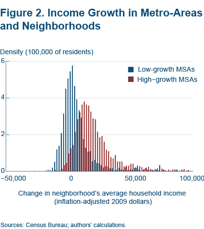
Figure 2 shows the relationship of the metro area’s income growth and neighborhood income growth visually. Low-income neighborhoods in high-growth metro areas (the 25 metro areas with the highest income growth) tended to experience much larger increases in household income than low-income neighborhoods in low-growth metro areas (the 25 metro areas with the lowest income growth).
Residential Sorting
What might explain why income grew more for low-income neighborhoods that were located in metro areas experiencing income growth, but not those in stagnant metro areas? Two potential explanations are residential sorting—changes in population and demographics within neighborhoods—and industry mix, especially as it relates to the employment opportunities available in a metro area.
Residential sorting could explain the relationship if low-income neighborhoods in high-growth metro areas experienced an influx of new residents with high incomes and educational attainment, or alternatively, if low-income neighborhoods in low-growth metro areas lost residents with high-income growth. Industry mix could explain the relationship if the residents of low-income neighborhoods that did not grow were employed in industries that were especially sensitive to the performance of the metro area as a whole.
Although we cannot say for sure, we do find some evidence that supports the residential sorting hypothesis: The population of the median low-income neighborhood in a high-growth metro area grew by 10.0 percent between 1980 and 2010, whereas the population of the median low-income neighborhood in a low-growth metro area actually shrank by 20.9 percent.
Likewise, all low-income neighborhoods experienced increases in educational attainment, but the greatest gains occurred in large-improvement neighborhoods (table 5). And although all low-income neighborhoods increased their share of Hispanic residents, large-improvement neighborhoods also reduced their shares of both black and white residents. If large improvements in the incomes of low-income neighborhoods resulted from the inflow of new, higher-income residents over recent decades, then Hispanic residents were an important part of the inflow.
Table 5. Low-Income Neighborhoods that Grew Richer Experienced Residential Sorting
| Percent change in low-income neighborhood’s average, 1980–2008 | No-improvement neighborhoods | Small-improvement neighborhoods | Large-improvement neighborhoods |
| Share with a bachelor’s degree | +1.9 | +5.6 | +16.7 |
| Share with a high school diploma | +18.1 | +19.7 | +24.6 |
| Share white | −14.8 | −11.3 | −5.3 |
| Share black | +8.0 | +1.5 | −4.4 |
| Share Hispanic | +10.7 | +13.5 | +9.5 |
Sources: Census Bureau; authors’ calculations.
Implications
While the economic characteristics of US neighborhoods have been highly persistent over the past three decades, some low-income neighborhoods do, nevertheless, move up the income distribution. Those that experienced large improvements in income over the past three decades tended to be located in large, densely populated metro areas that grew in income and population.
These results indicate that just as an individual’s outcomes might be strongly influenced by the neighborhood in which he or she resides, a neighborhood’s outcomes might be influenced by broader trends in the surrounding metro area. Investment and policy decisions aimed at supporting low-income neighborhoods could benefit from an understanding of how targeted neighborhoods are influenced by the metro areas that surround them.
Footnotes
- We define neighborhoods as census tracts, which are themselves defined as homogenous geographic areas that typically have about 4,000 residents. Data collection has recently changed so that information about geographic areas that was once collected as representative of the decennial census years (2000 and earlier) is now collected as representative of a five-year average. We use 2008 as shorthand for the five-year period 2006-2010 in our data.
- We convert all dollar measurements into real (inflation-adjusted) 2009 dollars using the Bureau of Economic Analysis’s Personal Consumption Expenditures price index. Inflation—and therefore personal consumption expenditures—accounts for most of the variation in the cost of living and related expenses in our sample metro areas between 1980 and 2010. However, it is important to remember that variation in prices throughout US metropolitan areas remains, even after accounting for inflation. There are some serious measurement issues related to regional variation in prices. One issue is initial differences in the relative prices of goods and services across cities, for which the Bureau of Economic Analysis has developed a “regional price parity” index. Another issue is that inflation also varies over metro areas (see Dunne and Fee 2008, “Real Income Growth across Metropolitan Areas.”) We cannot address these issues because metro-area-specific measures are not available for all our metro areas for our entire sample period.
- The 1980 poverty threshold for a family of four was $20,061 in inflation-adjusted 2009 dollars.
- Aaronson (2001) also found that neighborhood rankings, in terms of average household income, were highly persistent from 1970 to 1990.
- These classifications correspond to being below the 17th percentile of changes in neighborhood income, between the 17th and 68th percentile, and between the 68th and 99th percentile.
Recommended Reading
“Neighborhood Dynamics,” Daniel Aaronson, 2001. Journal of Urban Economics 49(1), 1-31.
“Inequality and City Size,” Nathaniel Baum-Snow and Ronni Pavan, 2013. Review of Economics and Statistics 95(5), 1535-1548.
“Residential Mobility and Neighborhood Change: Real Neighborhoods under the Microscope,” Claudia J. Coulton, Brett Theodos, and Margery Austin Turner, 2012. Cityscape: A Journal of Policy Development and Research 14(3).
“The Challenge of Our Declining Big Cities,” Anthony Downs, 1997. Housing Policy Debate 8(2), 359-408.
“Real Income Growth across Metropolitan Areas,” Timothy Dunne and Kyle Fee, 2008, Federal Reserve Bank of Cleveland, Economic Trends.
“Inner-city Concentrated Poverty and Neighborhood Distress: 1970 to 1990.” John D. Kasarda, 1993. Housing Policy Debate 4(3), 253-302.
Great American City: Chicago and the Enduring Neighborhood Effect. Robert J. Sampson, 2012. University of Chicago Press.
Source: Federal Reserve Bank of Cleveland

What's been said:
Discussions found on the web: