
3-D View of the Yield Curve
March 19, 2015 4:00pm by Barry Ritholtz

This content, which contains security-related opinions and/or information, is provided for informational purposes only and should not be relied upon in any manner as professional advice, or an endorsement of any practices, products or services. There can be no guarantees or assurances that the views expressed here will be applicable for any particular facts or circumstances, and should not be relied upon in any manner. You should consult your own advisers as to legal, business, tax, and other related matters concerning any investment. The commentary in this “post” (including any related blog, podcasts, videos, and social media) reflects the personal opinions, viewpoints, and analyses of the Ritholtz Wealth Management employees providing such comments, and should not be regarded the views of Ritholtz Wealth Management LLC. or its respective affiliates or as a description of advisory services provided by Ritholtz Wealth Management or performance returns of any Ritholtz Wealth Management Investments client. References to any securities or digital assets, or performance data, are for illustrative purposes only and do not constitute an investment recommendation or offer to provide investment advisory services. Charts and graphs provided within are for informational purposes solely and should not be relied upon when making any investment decision. Past performance is not indicative of future results. The content speaks only as of the date indicated. Any projections, estimates, forecasts, targets, prospects, and/or opinions expressed in these materials are subject to change without notice and may differ or be contrary to opinions expressed by others. The Compound Media, Inc., an affiliate of Ritholtz Wealth Management, receives payment from various entities for advertisements in affiliated podcasts, blogs and emails. Inclusion of such advertisements does not constitute or imply endorsement, sponsorship or recommendation thereof, or any affiliation therewith, by the Content Creator or by Ritholtz Wealth Management or any of its employees. Investments in securities involve the risk of loss. For additional advertisement disclaimers see here: https://www.ritholtzwealth.com/advertising-disclaimers Please see disclosures here: https://ritholtzwealth.com/blog-disclosures/
What's been said:
Discussions found on the web:Posted Under
Previous Post
IMF Credit Outstanding By Member
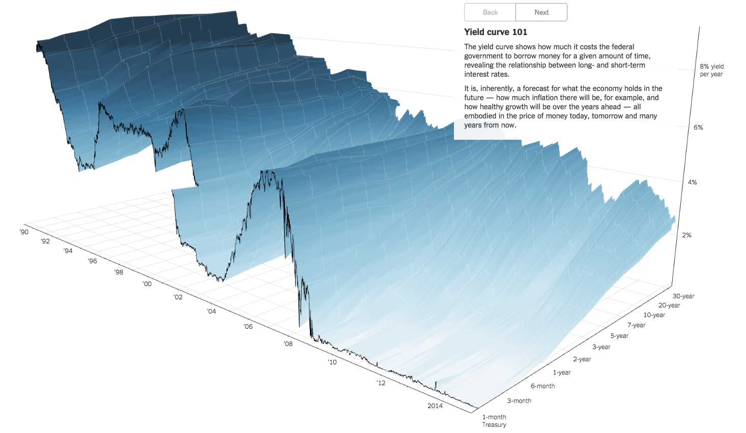
It would be interesting to see a movie made of this chart, with minute-by-minute intervals of snapshots (or whatever time interval produces the least noise in the sheet), with a selection of playback speeds. Once one had enough data in this hypothetical movie, one might play at trying to “surf” one’s way across the surface, following hypothetical ripples or waves that might be “perceived”, riding waves up and down, collecting differentials all the way. A computer would likely go a better job of this, but it would be an incredible trading gimmick, whether it actually worked or not.
You would need to add the appropriate sound effects.
(Laughter) from Fed minutes
Oh no Mr. Bill! (Lehman crisis)
YAY!! (shouts from the bond and stock market pits whenever QE is announced)
To the tune of Wipeout by The Surfaris
Being a mathematical surface, there is a lot of mathematical goo under that surface prior to 2007 that the fed squeezed out the back of the 3-D graph starting in 2009. You think that goo will come back? Will it be a tsunami?
Seriously, that is a cool graph, but it tells an important tale of caution. Will it ever return to histoical behavior? Is that the tide going out, only to return all too quickly?