This content, which contains security-related opinions and/or information, is provided for informational purposes only and should not be relied upon in any manner as professional advice, or an endorsement of any practices, products or services. There can be no guarantees or assurances that the views expressed here will be applicable for any particular facts or circumstances, and should not be relied upon in any manner. You should consult your own advisers as to legal, business, tax, and other related matters concerning any investment. The commentary in this “post” (including any related blog, podcasts, videos, and social media) reflects the personal opinions, viewpoints, and analyses of the Ritholtz Wealth Management employees providing such comments, and should not be regarded the views of Ritholtz Wealth Management LLC. or its respective affiliates or as a description of advisory services provided by Ritholtz Wealth Management or performance returns of any Ritholtz Wealth Management Investments client. References to any securities or digital assets, or performance data, are for illustrative purposes only and do not constitute an investment recommendation or offer to provide investment advisory services. Charts and graphs provided within are for informational purposes solely and should not be relied upon when making any investment decision. Past performance is not indicative of future results. The content speaks only as of the date indicated. Any projections, estimates, forecasts, targets, prospects, and/or opinions expressed in these materials are subject to change without notice and may differ or be contrary to opinions expressed by others. The Compound Media, Inc., an affiliate of Ritholtz Wealth Management, receives payment from various entities for advertisements in affiliated podcasts, blogs and emails. Inclusion of such advertisements does not constitute or imply endorsement, sponsorship or recommendation thereof, or any affiliation therewith, by the Content Creator or by Ritholtz Wealth Management or any of its employees. Investments in securities involve the risk of loss. For additional advertisement disclaimers see here: https://www.ritholtzwealth.com/advertising-disclaimers Please see disclosures here: https://ritholtzwealth.com/blog-disclosures/
Biotech and healthcare generally certainly look overbought here but not so much for the rest as far as I can tell. Looks more like late mid-cycle to me: Maybe trim some fattened positions but keep on ride’n.
“Dollar depreciation leads to higher inflation and ultimately forces foreign creditors to question their rationale and indeed their sanity for continuing purchases of U.S. Treasuries.”
Don’t know much about history, don’t know much macroeconomy ….
Yes, this is great and so true. I also have noticed about “screw it I’m all in” time people start bragging about how much they’ve made buying this stock or that stock. When I start hearing these kinds of comments, it is usually indicative of something that isn’t good. I agree nobody knows for sure, it is just a matter of probabilities. I’ve held biotech and health care for a long time. Might be time to unload these puppies especially biotech. Looks speciously probable that these are bubblicious/frothy to me.
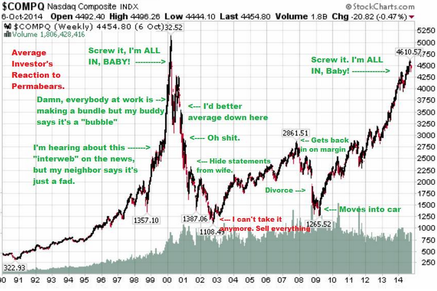
Interesting chart (with a lot of funny annotations) and also the responses to it, with most (all?) of the commenters reacting solely to the price movement, salivating in Pavlovian fashion at the mere hint of a “bubble”.
Nobody seems to notice that in the first “Screw it, I’m ALL IN BABY!” point, the volume steadily increases, spiking as the price spikes, but then continuing to increase as the price collapses, not making a major turn in direction until the BOTTOM is reached from the late-2007 through 2009 decline in March of 2009, at which point trading volumes declines with minor fluctuations, such that trading volumes today are pretty close to where they were at the bottom in 2003.
For data to have a sliver of a chance to be interpreted (guessed at) reasonably, there needs to be an accompanying narrative that encompasses ALL of the data, not just the shiny spots that attract the attention of the gibbering masses.
What does the behavior of the trading volume mean, and how is it connected to price movements? One would expect to see trading volumes generally rise with the growth in the underlying economy.
Several stories spring to mind:
1) the volume data is meaningless, due to unreported dark pool trading
2) until volume begins to soar as well, indicating a drawing back into the markets of those who were scared away for a generation (or two), we are nowhere near a peak.
3) the character of the NASDAQ has changed over the intervening quarter century, and is a lot less like a penny stock market today, with (unproven assertion) the average NASDAQ market cap being significantly larger and more stable (larger = more stable? another unproven assertion, LEH & AIG beg to differ), with greater stability implying less jittery trading (yet ANOTHER unproven assertion)
4) if we factor in the average PE of the NASDAQ, things look a whole lot more rationally valued (not necessarily rational, but MORE rational) today than they were in 2000 … perhaps the current peak will pop closer to 10,000 than 5,000
5) the whole chart is intended as nothing more than fodder for humor, not to be taken seriously, except for the hint of narratives that might accompany each of the funny annotations


Biotech and healthcare generally certainly look overbought here but not so much for the rest as far as I can tell. Looks more like late mid-cycle to me: Maybe trim some fattened positions but keep on ride’n.
LMAO!!! This is so…..true…..
The QOTD from Bill Gross made me laugh.
“Dollar depreciation leads to higher inflation and ultimately forces foreign creditors to question their rationale and indeed their sanity for continuing purchases of U.S. Treasuries.”
Don’t know much about history, don’t know much macroeconomy ….
Nobody knows. Anyone who says they know is lying or ignorant probably both.
Stick to your asset allocation through thick and thin and you will do great.
These guys are talking their book. They are short, want people to sell so they make a little money.
Read the sports pages, or better yet a good book.
This graph clearly shows why I am heavily invested in liquor stocks.
Barrels or firkins?
Yes, this is great and so true. I also have noticed about “screw it I’m all in” time people start bragging about how much they’ve made buying this stock or that stock. When I start hearing these kinds of comments, it is usually indicative of something that isn’t good. I agree nobody knows for sure, it is just a matter of probabilities. I’ve held biotech and health care for a long time. Might be time to unload these puppies especially biotech. Looks speciously probable that these are bubblicious/frothy to me.
Let me count the ways I love this chart of truth. There will never be one better.
It’s ALL about the story!
Interesting chart (with a lot of funny annotations) and also the responses to it, with most (all?) of the commenters reacting solely to the price movement, salivating in Pavlovian fashion at the mere hint of a “bubble”.
Nobody seems to notice that in the first “Screw it, I’m ALL IN BABY!” point, the volume steadily increases, spiking as the price spikes, but then continuing to increase as the price collapses, not making a major turn in direction until the BOTTOM is reached from the late-2007 through 2009 decline in March of 2009, at which point trading volumes declines with minor fluctuations, such that trading volumes today are pretty close to where they were at the bottom in 2003.
For data to have a sliver of a chance to be interpreted (guessed at) reasonably, there needs to be an accompanying narrative that encompasses ALL of the data, not just the shiny spots that attract the attention of the gibbering masses.
What does the behavior of the trading volume mean, and how is it connected to price movements? One would expect to see trading volumes generally rise with the growth in the underlying economy.
Several stories spring to mind:
1) the volume data is meaningless, due to unreported dark pool trading
2) until volume begins to soar as well, indicating a drawing back into the markets of those who were scared away for a generation (or two), we are nowhere near a peak.
3) the character of the NASDAQ has changed over the intervening quarter century, and is a lot less like a penny stock market today, with (unproven assertion) the average NASDAQ market cap being significantly larger and more stable (larger = more stable? another unproven assertion, LEH & AIG beg to differ), with greater stability implying less jittery trading (yet ANOTHER unproven assertion)
4) if we factor in the average PE of the NASDAQ, things look a whole lot more rationally valued (not necessarily rational, but MORE rational) today than they were in 2000 … perhaps the current peak will pop closer to 10,000 than 5,000
5) the whole chart is intended as nothing more than fodder for humor, not to be taken seriously, except for the hint of narratives that might accompany each of the funny annotations