This content, which contains security-related opinions and/or information, is provided for informational purposes only and should not be relied upon in any manner as professional advice, or an endorsement of any practices, products or services. There can be no guarantees or assurances that the views expressed here will be applicable for any particular facts or circumstances, and should not be relied upon in any manner. You should consult your own advisers as to legal, business, tax, and other related matters concerning any investment. The commentary in this “post” (including any related blog, podcasts, videos, and social media) reflects the personal opinions, viewpoints, and analyses of the Ritholtz Wealth Management employees providing such comments, and should not be regarded the views of Ritholtz Wealth Management LLC. or its respective affiliates or as a description of advisory services provided by Ritholtz Wealth Management or performance returns of any Ritholtz Wealth Management Investments client. References to any securities or digital assets, or performance data, are for illustrative purposes only and do not constitute an investment recommendation or offer to provide investment advisory services. Charts and graphs provided within are for informational purposes solely and should not be relied upon when making any investment decision. Past performance is not indicative of future results. The content speaks only as of the date indicated. Any projections, estimates, forecasts, targets, prospects, and/or opinions expressed in these materials are subject to change without notice and may differ or be contrary to opinions expressed by others. The Compound Media, Inc., an affiliate of Ritholtz Wealth Management, receives payment from various entities for advertisements in affiliated podcasts, blogs and emails. Inclusion of such advertisements does not constitute or imply endorsement, sponsorship or recommendation thereof, or any affiliation therewith, by the Content Creator or by Ritholtz Wealth Management or any of its employees. Investments in securities involve the risk of loss. For additional advertisement disclaimers see here: https://www.ritholtzwealth.com/advertising-disclaimers Please see disclosures here: https://ritholtzwealth.com/blog-disclosures/
You have to reduce it by capacity factor. The net capacity factor of a power plant is the ratio of its actual output over a period of time, to its potential output if it were possible for it to operate at full nameplate capacity continuously over the same period of time.
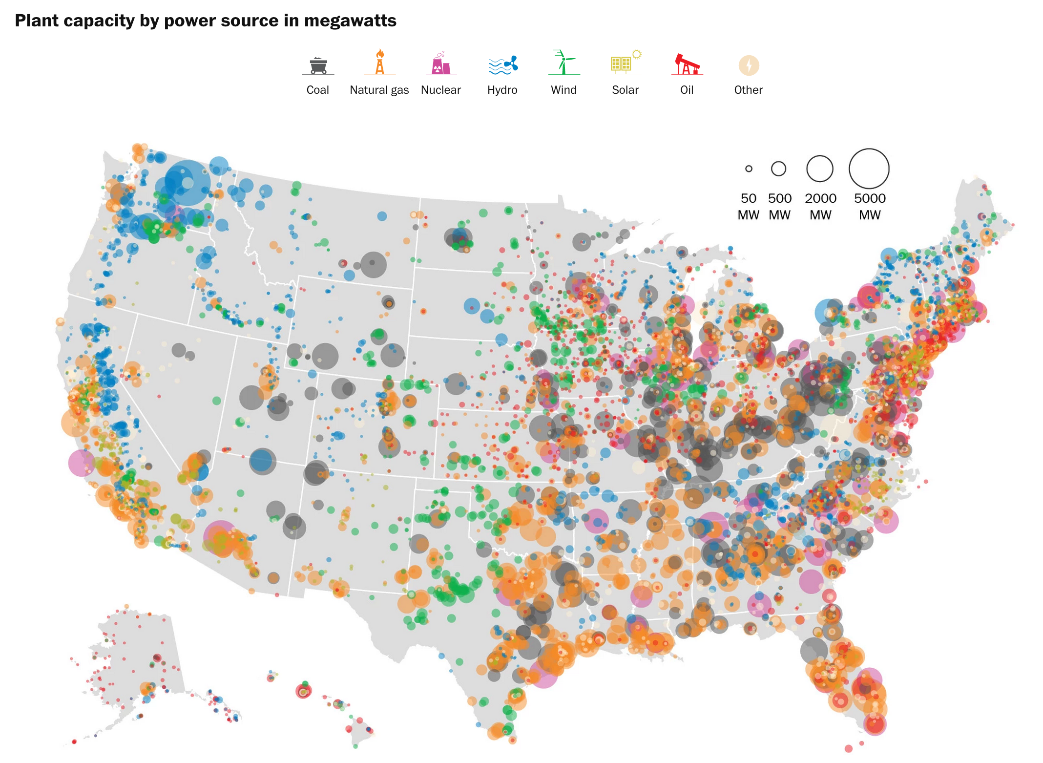
Little green and mustard dots far outnumber the big purple dots. But don’t worry:
Due to windy days, the windmills generate less than 5% of the electricity total,.
Due to night time, the solars generate less than 1% of the electricity total.
Due to always-on nature of nuke plants, the atoms generate 20% of the electricity total… that after a 30 year pause in new plant openings.
“The dot sizes represent plant capacity.
You have to reduce it by capacity factor.”
That would show actual generation, as you note. What would be interesting to me would be to compare a graphic showing actual generation of electricity with a graphic showing generation-related production of carbon dioxide.
Missing from the map is rooftop PV, which is significant in Hawaii and becoming significant in California, Arizona, and perhaps other states. High-PV states will be adding monthly connection fees as PV penetration increases. An analogous, though off-topic for this post, situation would be proposed changes in highway funding as average gasoline consumption per mile driven drops and many drivers pay little or no gasoline tax.
Sure, it’s growing by leaps and bounds, but it’s tiny compared to overall energy usage. There are neighborhoods with clusters of PV in CA and HI getting 15-20% solar. The very largest community solar projects in the US produce enough solar to power about 200 homes.
Now, look at the big picture. CA alone consumes about 290 TWh of electricity per year. Last year, it generated about 12.5 TWh from solar (PV and thermal combined), so CA is about 4.3% solar. The nation as a whole is about 0.4% solar and the EIA’s 2015 report indicates that given anticipated growth rates the US as a whole will only be 3% solar by the year 2040.
The thing most people don’t realize is that natural gas is growing as a fuel source much faster than solar, so even though solar’s year over year growth looks impressive it’s actually adding less capacity than other energy sources.
Note that due to distance, lack of alternatives and total lack of vision California is effectively wholly dependent upon NatGas for its grid base. It would not even be possible to energize the grid for emergency only supply without NatGas. Way to go greenies. That said, notice several clusres of generation capacity just over the CA borders in three critical areas. Almost as if pushing stuff over the border makes it go away.
I also want to point out that YTD figures like the ones in the WaPo article will overemphasize solar capacity since they include the summer solstice and not the winter solstice.
Don’t misunderstand, I want there to be a lot more solar, but the party line lately seems to be that solar is already changing everything when it’s really barely scratching the surface.


The dot sizes represent plant capacity.
You have to reduce it by capacity factor. The net capacity factor of a power plant is the ratio of its actual output over a period of time, to its potential output if it were possible for it to operate at full nameplate capacity continuously over the same period of time.
Little green and mustard dots far outnumber the big purple dots. But don’t worry:
Due to windy days, the windmills generate less than 5% of the electricity total,.
Due to night time, the solars generate less than 1% of the electricity total.
Due to always-on nature of nuke plants, the atoms generate 20% of the electricity total… that after a 30 year pause in new plant openings.
“The dot sizes represent plant capacity.
You have to reduce it by capacity factor.”
That would show actual generation, as you note. What would be interesting to me would be to compare a graphic showing actual generation of electricity with a graphic showing generation-related production of carbon dioxide.
Missing from the map is rooftop PV, which is significant in Hawaii and becoming significant in California, Arizona, and perhaps other states. High-PV states will be adding monthly connection fees as PV penetration increases. An analogous, though off-topic for this post, situation would be proposed changes in highway funding as average gasoline consumption per mile driven drops and many drivers pay little or no gasoline tax.
The scale of PV solar is a popular misconception.
Sure, it’s growing by leaps and bounds, but it’s tiny compared to overall energy usage. There are neighborhoods with clusters of PV in CA and HI getting 15-20% solar. The very largest community solar projects in the US produce enough solar to power about 200 homes.
Now, look at the big picture. CA alone consumes about 290 TWh of electricity per year. Last year, it generated about 12.5 TWh from solar (PV and thermal combined), so CA is about 4.3% solar. The nation as a whole is about 0.4% solar and the EIA’s 2015 report indicates that given anticipated growth rates the US as a whole will only be 3% solar by the year 2040.
The thing most people don’t realize is that natural gas is growing as a fuel source much faster than solar, so even though solar’s year over year growth looks impressive it’s actually adding less capacity than other energy sources.
Sources:
http://energyalmanac.ca.gov/electricity/
http://energyalmanac.ca.gov/renewables/solar/index.php
http://www.eia.gov/forecasts/aeo/
http://www.pennenergy.com/marketwired-power/2015/08/5/nexamp-and-jiminy-peak-launch-construction-of-largest-community-solar-project-in-northeast.html
Note that due to distance, lack of alternatives and total lack of vision California is effectively wholly dependent upon NatGas for its grid base. It would not even be possible to energize the grid for emergency only supply without NatGas. Way to go greenies. That said, notice several clusres of generation capacity just over the CA borders in three critical areas. Almost as if pushing stuff over the border makes it go away.
WTF is the problem with that?
Is it because its cheap, clean and plentiful?
I also want to point out that YTD figures like the ones in the WaPo article will overemphasize solar capacity since they include the summer solstice and not the winter solstice.
Don’t misunderstand, I want there to be a lot more solar, but the party line lately seems to be that solar is already changing everything when it’s really barely scratching the surface.