This content, which contains security-related opinions and/or information, is provided for informational purposes only and should not be relied upon in any manner as professional advice, or an endorsement of any practices, products or services. There can be no guarantees or assurances that the views expressed here will be applicable for any particular facts or circumstances, and should not be relied upon in any manner. You should consult your own advisers as to legal, business, tax, and other related matters concerning any investment. The commentary in this “post” (including any related blog, podcasts, videos, and social media) reflects the personal opinions, viewpoints, and analyses of the Ritholtz Wealth Management employees providing such comments, and should not be regarded the views of Ritholtz Wealth Management LLC. or its respective affiliates or as a description of advisory services provided by Ritholtz Wealth Management or performance returns of any Ritholtz Wealth Management Investments client. References to any securities or digital assets, or performance data, are for illustrative purposes only and do not constitute an investment recommendation or offer to provide investment advisory services. Charts and graphs provided within are for informational purposes solely and should not be relied upon when making any investment decision. Past performance is not indicative of future results. The content speaks only as of the date indicated. Any projections, estimates, forecasts, targets, prospects, and/or opinions expressed in these materials are subject to change without notice and may differ or be contrary to opinions expressed by others. The Compound Media, Inc., an affiliate of Ritholtz Wealth Management, receives payment from various entities for advertisements in affiliated podcasts, blogs and emails. Inclusion of such advertisements does not constitute or imply endorsement, sponsorship or recommendation thereof, or any affiliation therewith, by the Content Creator or by Ritholtz Wealth Management or any of its employees. Investments in securities involve the risk of loss. For additional advertisement disclaimers see here: https://www.ritholtzwealth.com/advertising-disclaimers Please see disclosures here: https://ritholtzwealth.com/blog-disclosures/
I would like to see a map like this with debt service payments/GDP . And it would be nice it those debt service payments were shown over the last couple of decades.
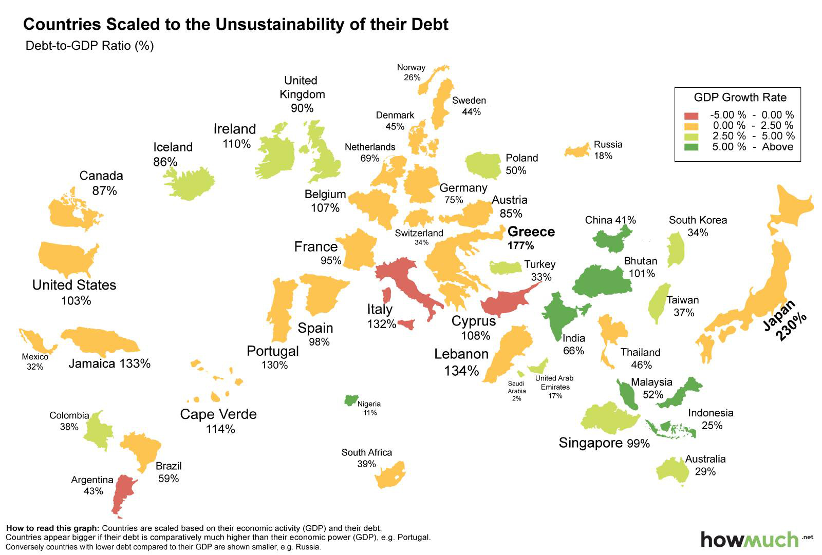
Russia is in much better shape than the USA? Then why did they have to import chickens from America (and cut a chickens for oil deal with China when they embargoed American chickens).
Ask me if I want to exchange my TIPS for ruble-denominated bonds. At ANY interest rate.
Seeing as that pretty much all of us look at the world through Mercator projection, can we assume they factored this into their calculations? Or is Greenland really going to be the biggest debtor?
Emerging-market debt has grown $28 trillion since 2009, according to the IIF, which on Monday introduced a database tracking 18 developing markets. Global debt has soared $50 trillion during the period to surpass a total of $240 trillion, or 320 percent of gross domestic product, in early 2015.
Map above has all the major economies (70-90% of worlds GDP??), and only Japan has a debt/gdp over 200%. So how world debt/gdp ratio over 320%??
I think they are confused about public debt and total (public+ private) debt. The map is public debt. The total of $240 trillion or 320% of GDP is total (public+ private) debt. Not that they make that clear.


The vector of world debt has grown $50 trillion and now 320% of world GDP.
http://www.bloomberg.com/news/articles/2015-11-10/asia-s-rapid-debt-buildup-tops-developing-markets-iif-says
I would like to see a map like this with debt service payments/GDP . And it would be nice it those debt service payments were shown over the last couple of decades.
Beat me to it. I was going to ask what interest rate each country pays, but your way is better.
Russia is in much better shape than the USA? Then why did they have to import chickens from America (and cut a chickens for oil deal with China when they embargoed American chickens).
Ask me if I want to exchange my TIPS for ruble-denominated bonds. At ANY interest rate.
Seeing as that pretty much all of us look at the world through Mercator projection, can we assume they factored this into their calculations? Or is Greenland really going to be the biggest debtor?
From the Bloomberg article ref above:
Emerging-market debt has grown $28 trillion since 2009, according to the IIF, which on Monday introduced a database tracking 18 developing markets. Global debt has soared $50 trillion during the period to surpass a total of $240 trillion, or 320 percent of gross domestic product, in early 2015.
Map above has all the major economies (70-90% of worlds GDP??), and only Japan has a debt/gdp over 200%. So how world debt/gdp ratio over 320%??
I think they are confused about public debt and total (public+ private) debt. The map is public debt. The total of $240 trillion or 320% of GDP is total (public+ private) debt. Not that they make that clear.