 The Fed held its benchmark Federal-Funds rate steady yesterday at 5.25% – 5.5%, leaving the possibility of cuts in...
Read More
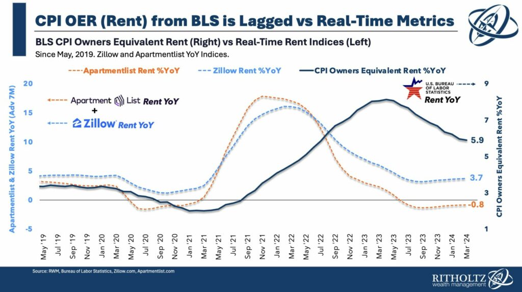
 A quick note on the state of the economy in light of some recent data. Q1 2024 Gross Domestic Product expanded at a...
Read More
At the Money: What Data Matters and What Doesn’t (April 24, 2024) Bill McBride has spent the past 20 years...
Read More
 Between book leave and COVID I have been pretty quiet lately. Since it’s been a few months, I thought we could take a...
Read More
We sometimes say “Demographics is Destiny,” but that’s abstract. To get a visual sense of what that looks like,...
Read More
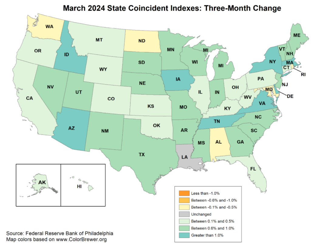
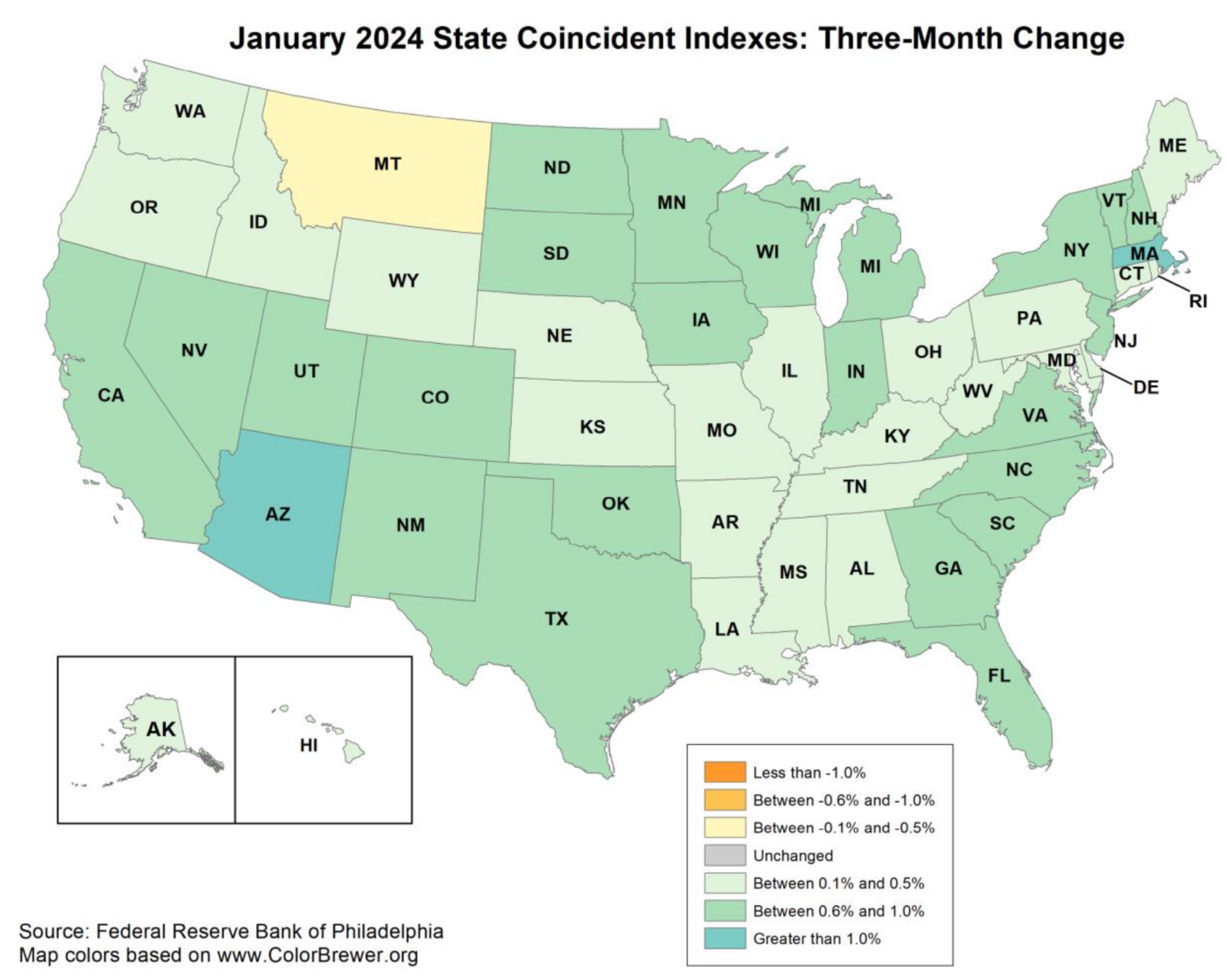
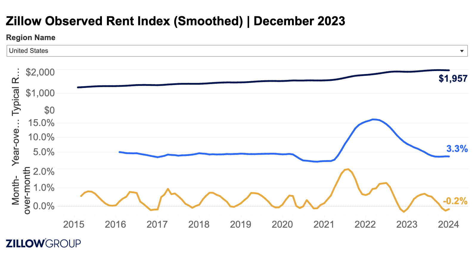
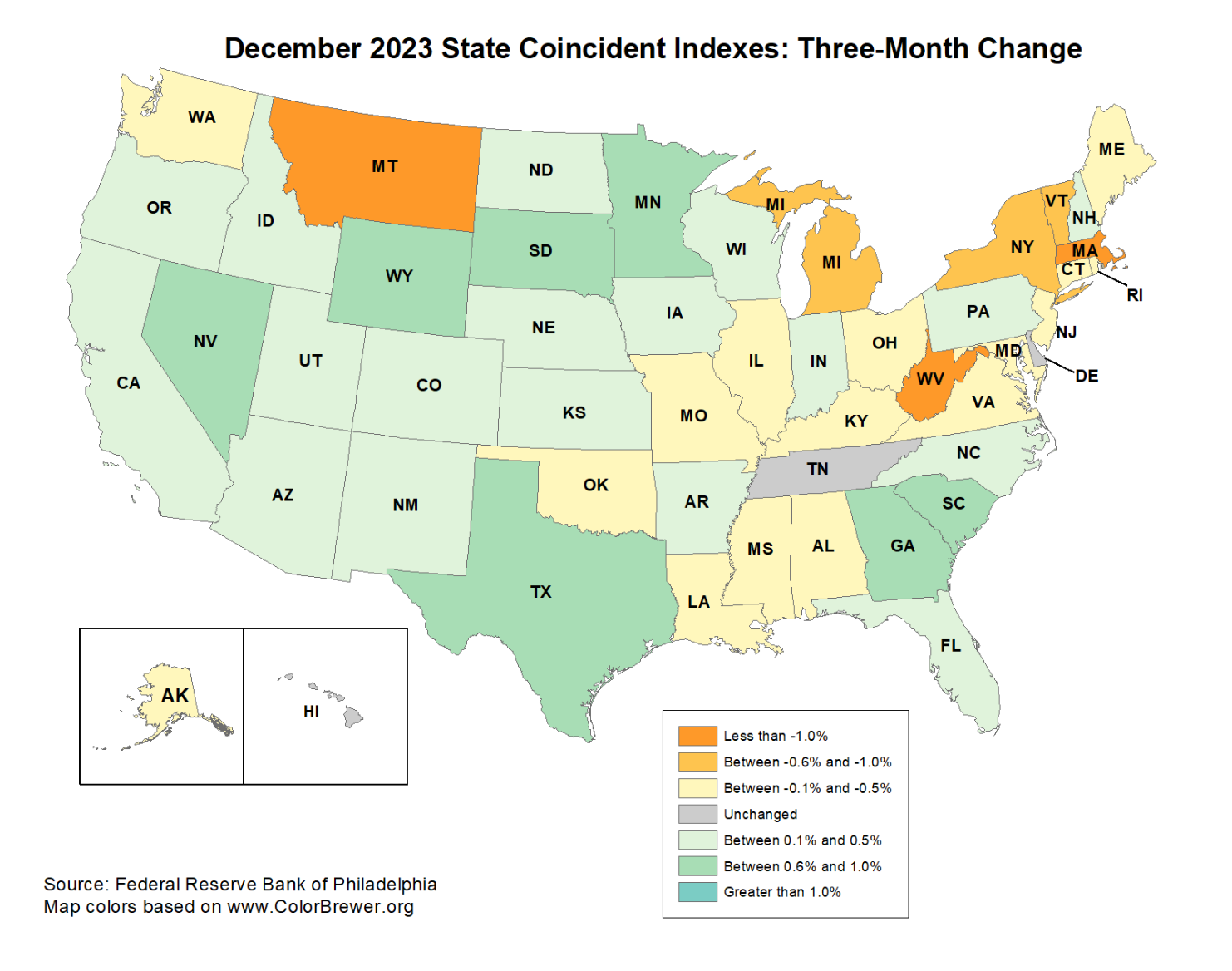 A quick follow-up to last month’s note on slipping coincident indicators: December was relatively stable compared to the...
Read More
 I am popping out of book leave to just throw a few charts at you regarding the Inflation data for December. CPI came in a 0.3%...
Read More
 You may have missed the most important data point in today’s Employment report. It wasn’t that Nonfarm payrolls...
Read More
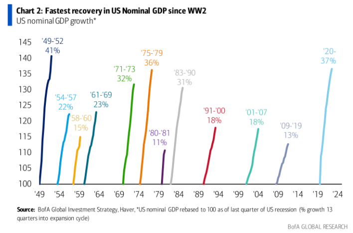 We just experienced the strongest economic recovery since the end of World War II Source: Irrelevant Investor Light posting as...
Read More
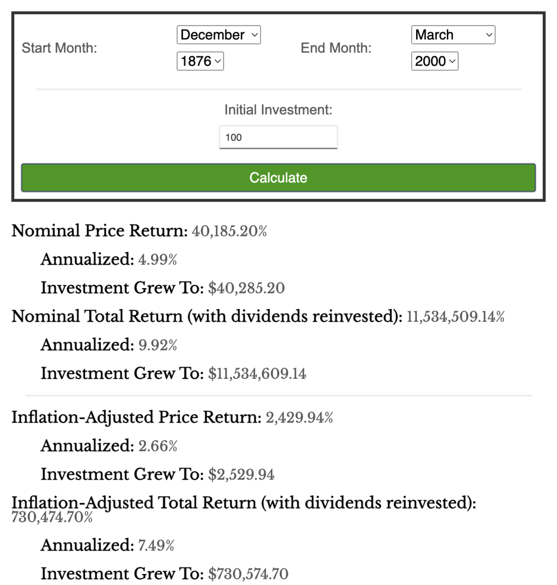 I have been playing with Nick’s S&P 500 calculator, and it’s pretty damned, cool. He used data from Robert...
Read More
