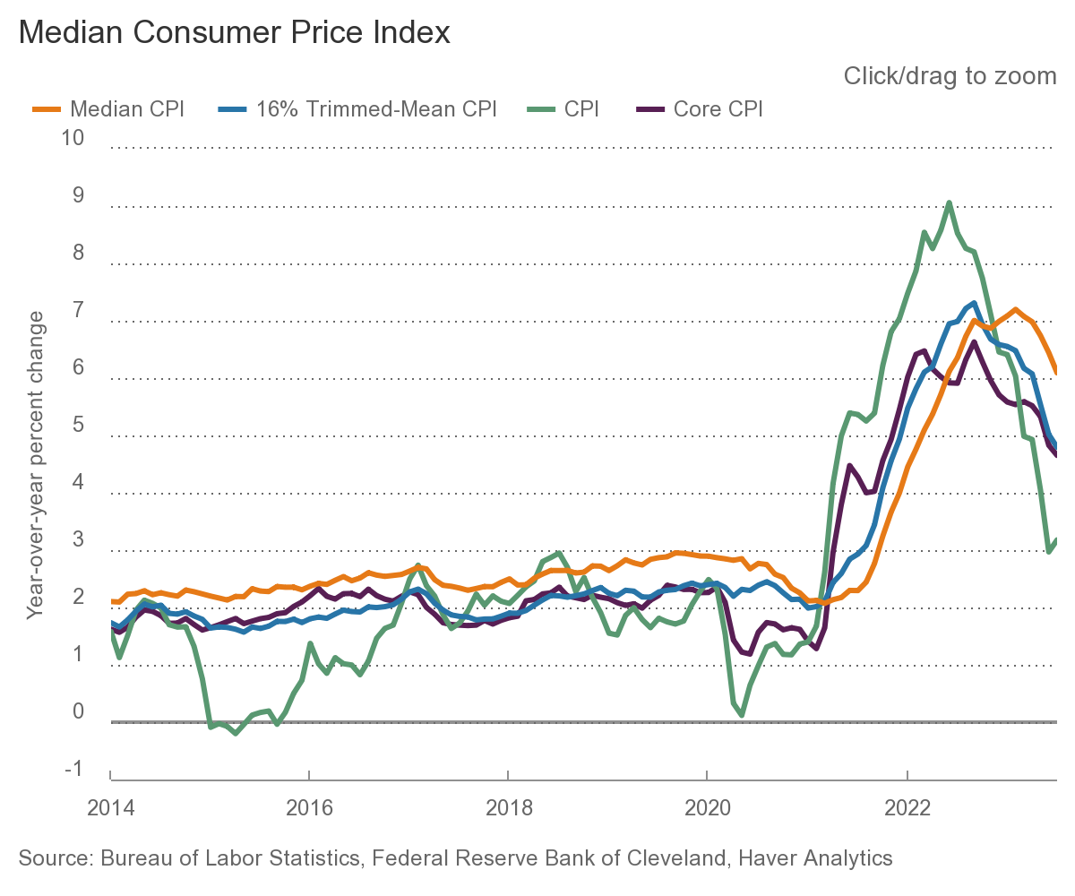
 A quick note on today’s BLS report on the Consumer Price Index (CPI), which rose 0.2% in July on a seasonally adjusted...
Read More
 My RWM colleagues Josh Brown and Michael Batnick do a bang-up job each week diving into the specifics of the newsflow in What Are...
Read More
 @TBPInvictus here; Let’s cut to the chase: “America’s Enormous Math Mistake” is a popular video on YouTube...
Read More
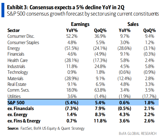
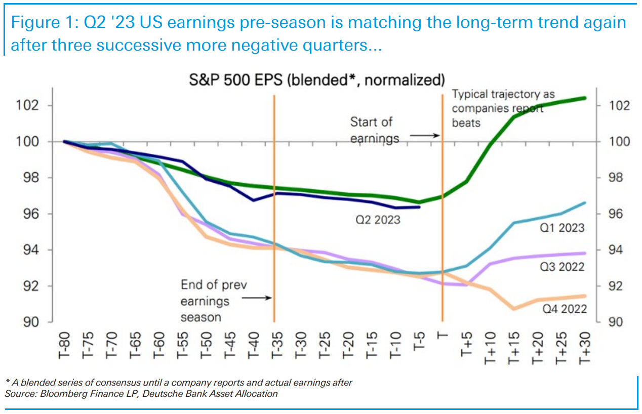 Jim Reid of Deutsche Bank notes the pattern of gradual downgrades before earnings season begins is back to normal. As the rest of...
Read More
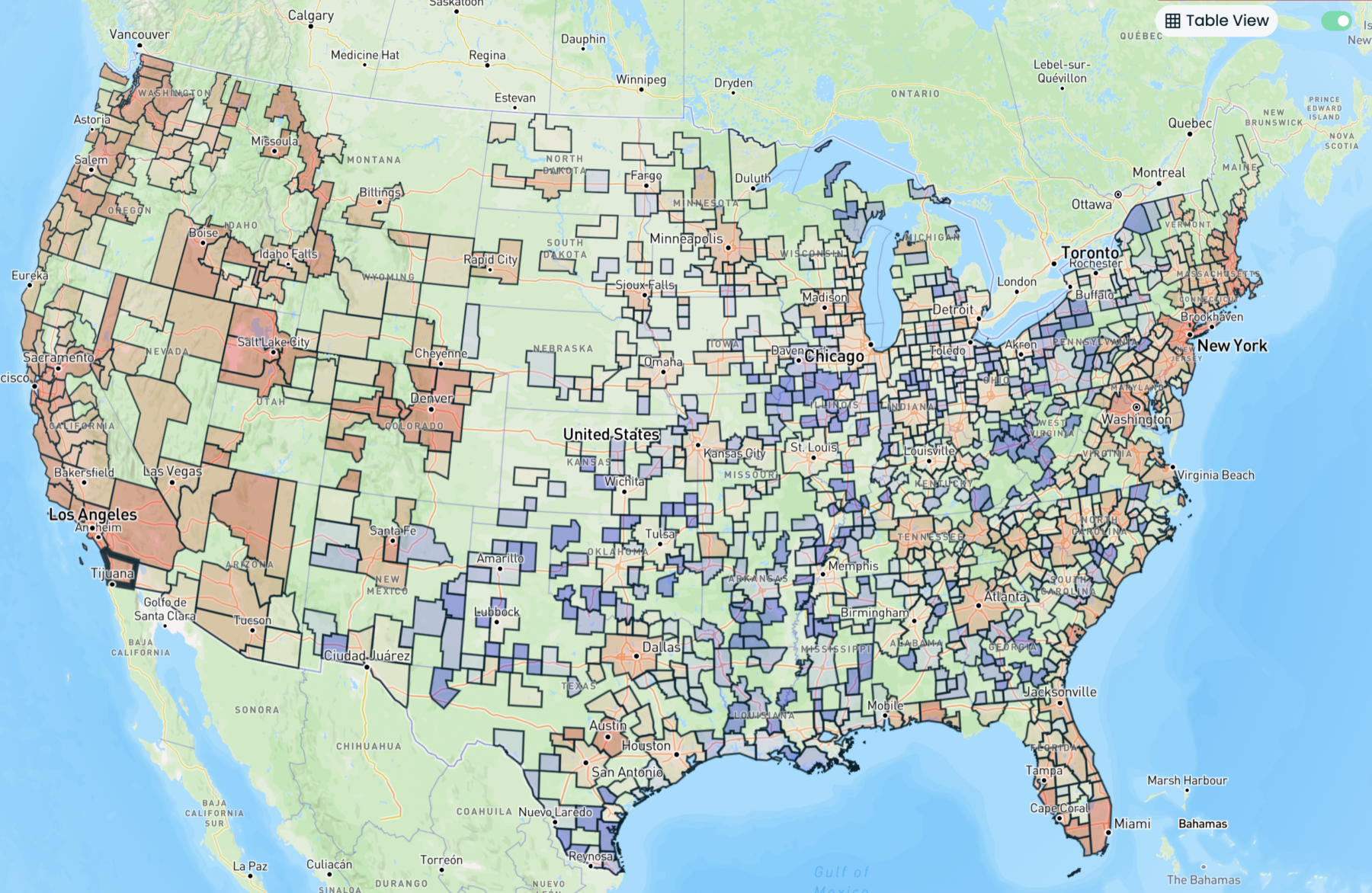 Source: Reventure Let’s get to the caveats up front: Re:Ventures has been pretty bearish on housing the past few years, even...
Read More
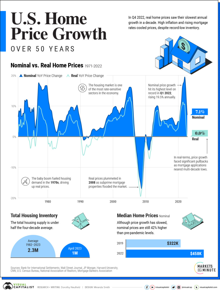 Fascinating chart from Visual Capitalist showing the history of housing prices in the United States. I recall the 1990 Home Price...
Read More
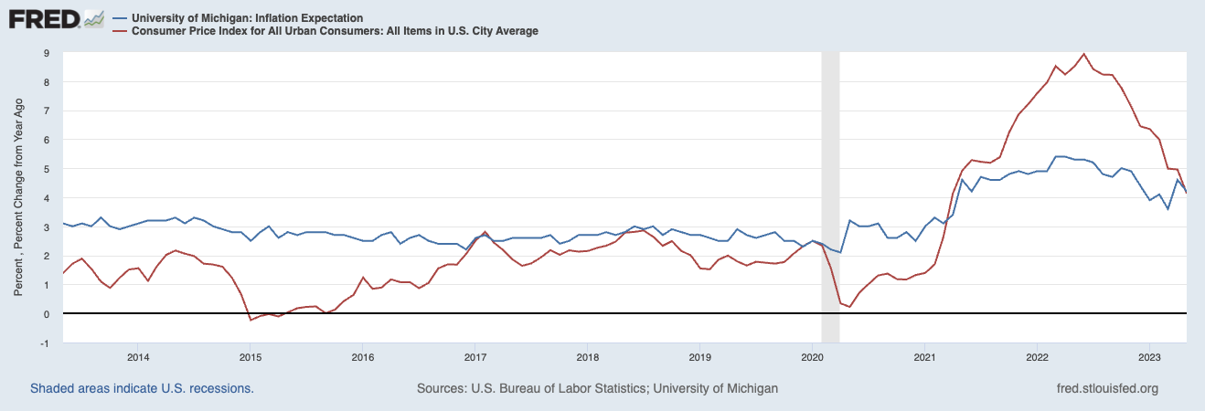 This morning, the WSJ reported that “Consumers expect to see 4.1% inflation a year from now, the lowest such reading in two...
Read More
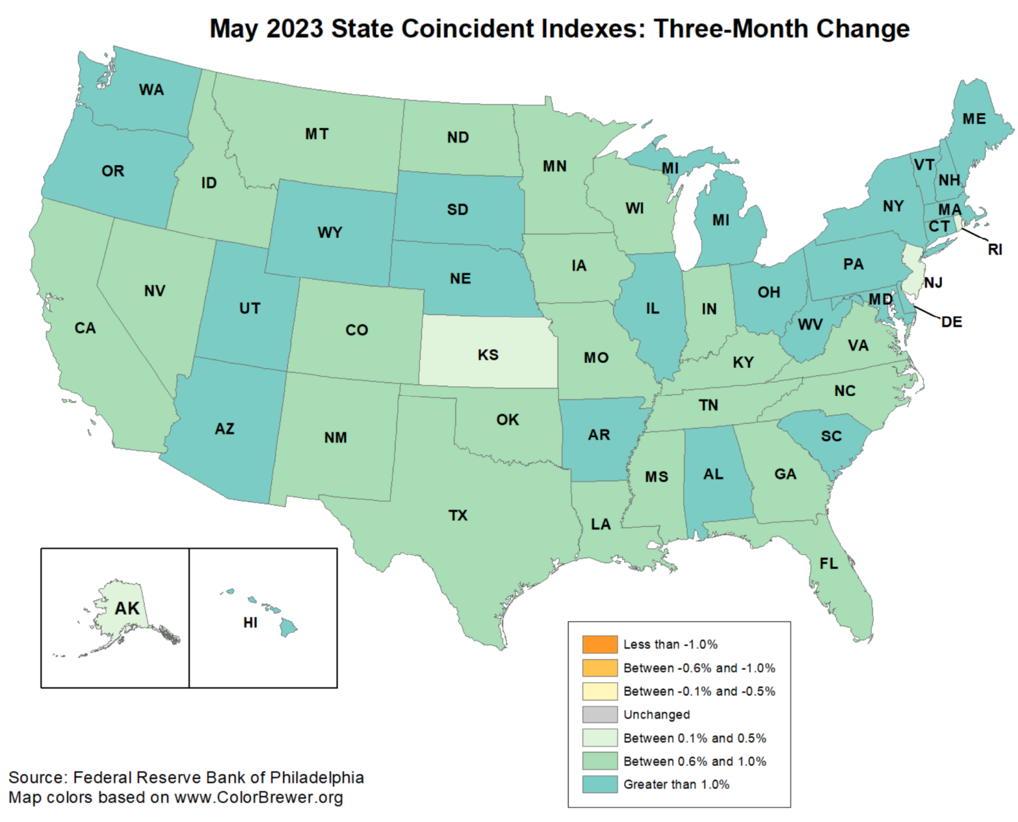 Rising rates, falling savings, increased deficits, dubious GDP: Ever since the yield curve inverted and warnings of...
Read More
@TBPInvictus here: Contrary to 40+ years and counting of “trickle down” narrative, the reality is that the gap between...
Read More
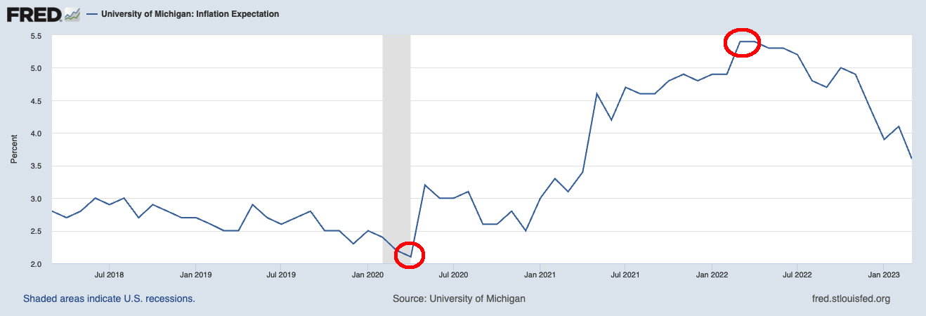 Jerome Powell and the Federal Reserve spend a lot of time worrying about Inflation Expectations. They shouldn’t. Generally,...
Read More
