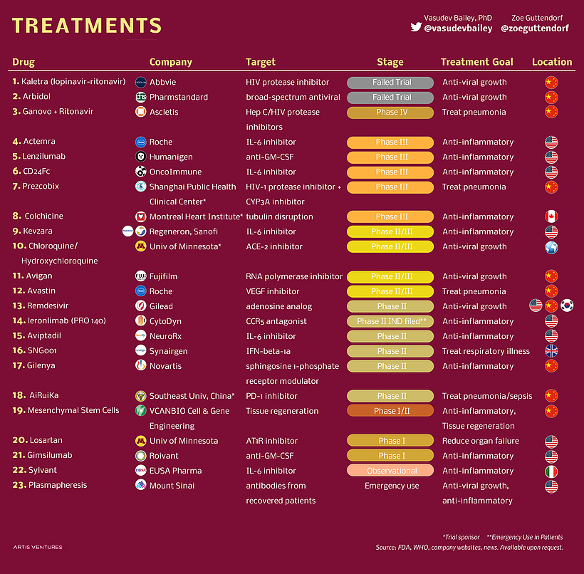
 New treatments under development for COVID-19 Source: Artis Ventures via Visual Capitalist Very interesting set of data...
Read More
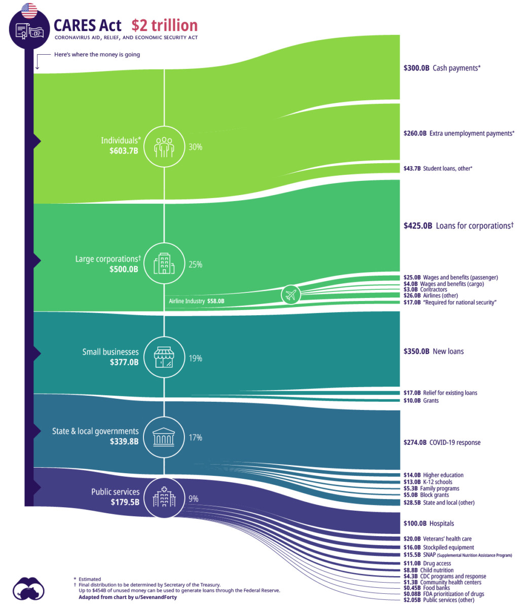 The Anatomy of the $2 Trillion COVID-19 Stimulus Bill Source: Visual Capitalist Terrific breakdown of the $2...
Read More
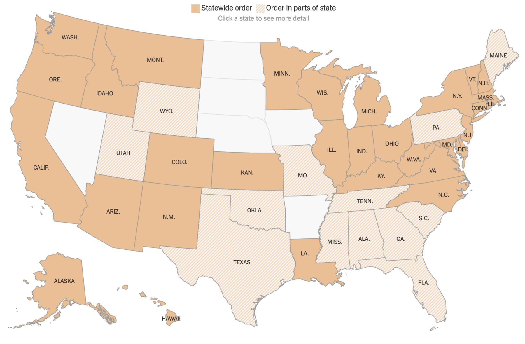 Click to see updated map of state and city “Shelter-in-Place” directives Source: NYT 261 million people in at...
Read More
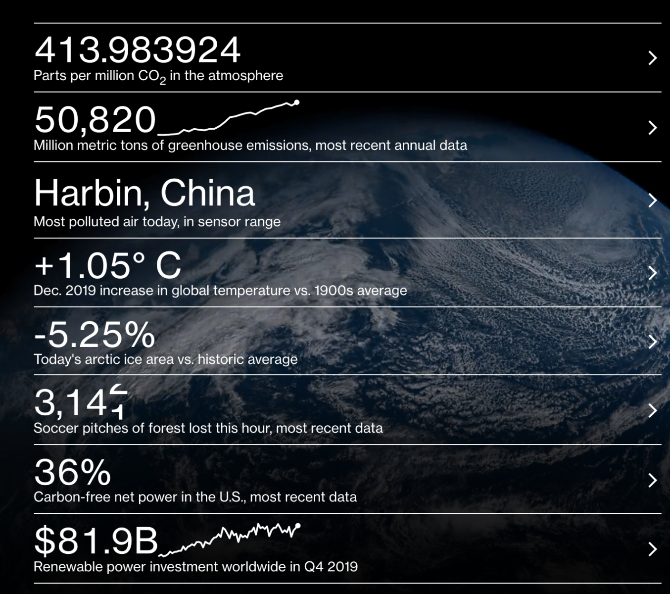 Source: Bloomberg Green This gets updated in real time, via Bloomberg data
Read More
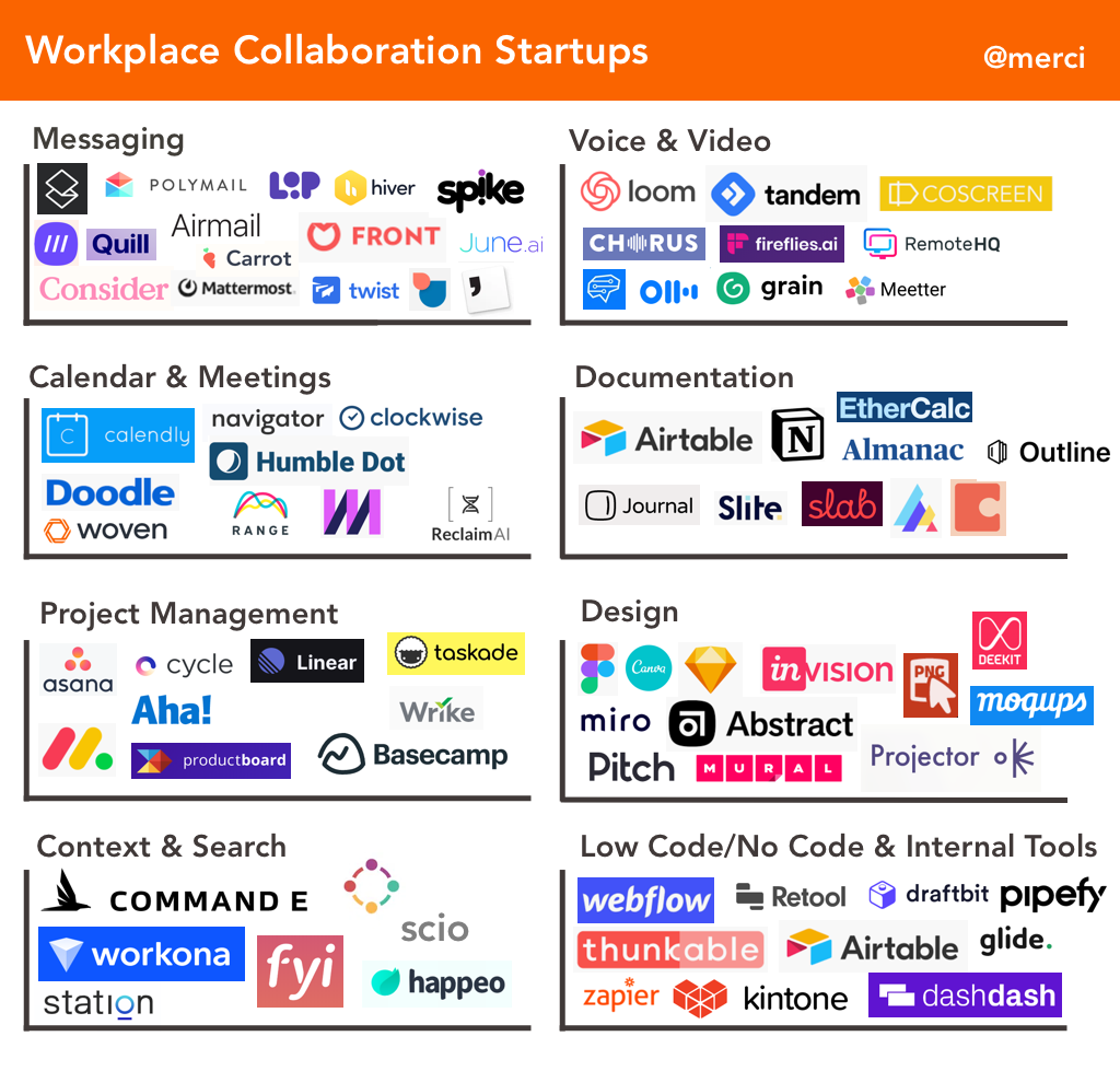 Source: Lightspeed Ventures We use slack in the office. In many ways, it is superior to email; where it fails is when it tries to...
Read More
 I am working on my post-holiday retail sales review, and its filled with some interesting surprises. Over the course of my research, I...
Read More
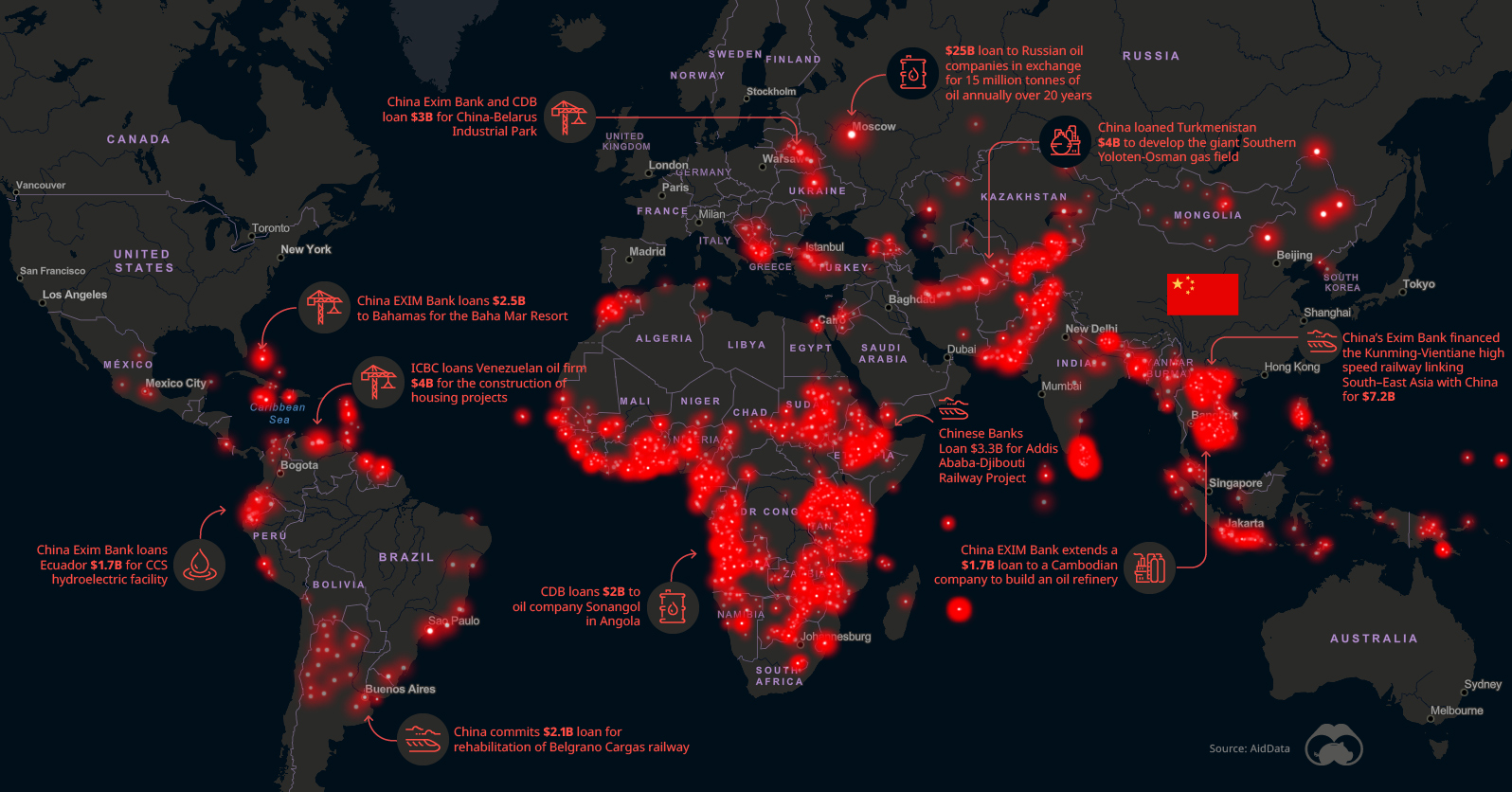 Chinese Financing is Fueling Megaprojects Around the World Source: Visual Capitalist Research lab AidData (part of W&M...
Read More
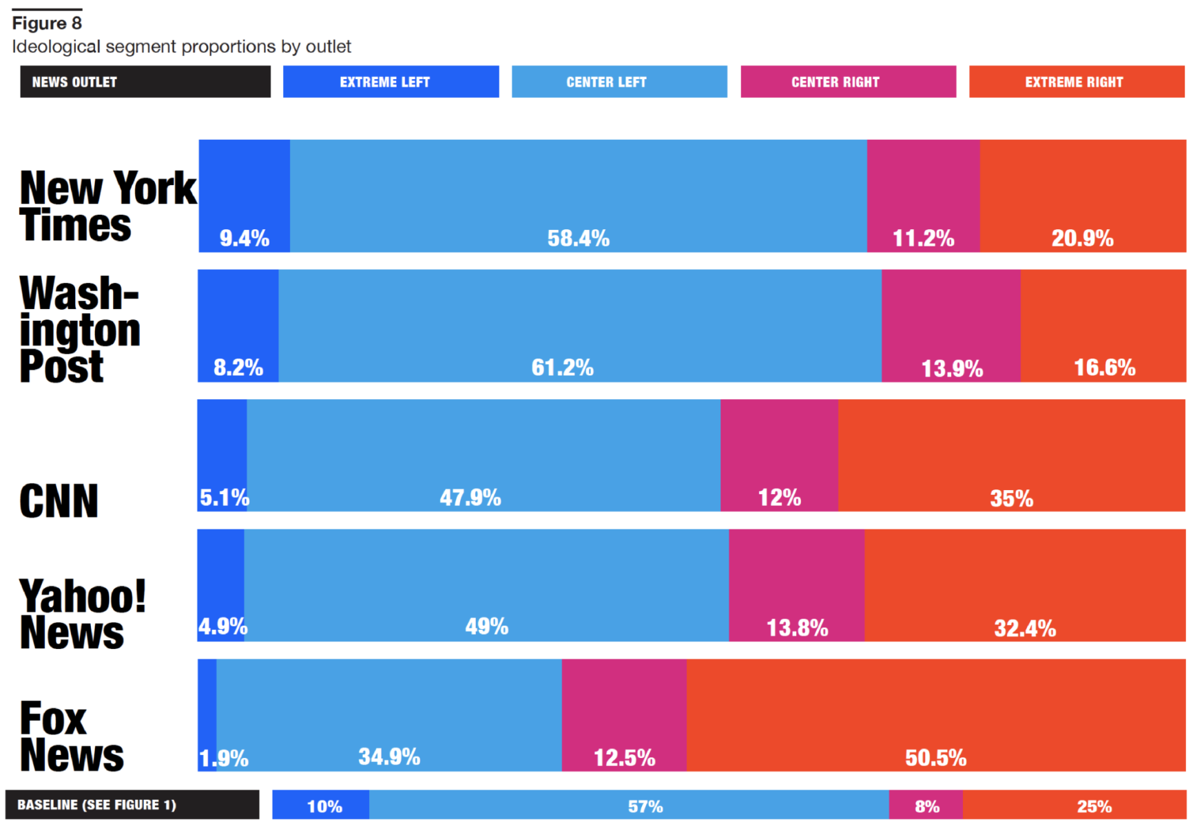 Source: Knight Foundation What is most intriguing about this is not the Left/Right divide, but the differentials within the Left...
Read More
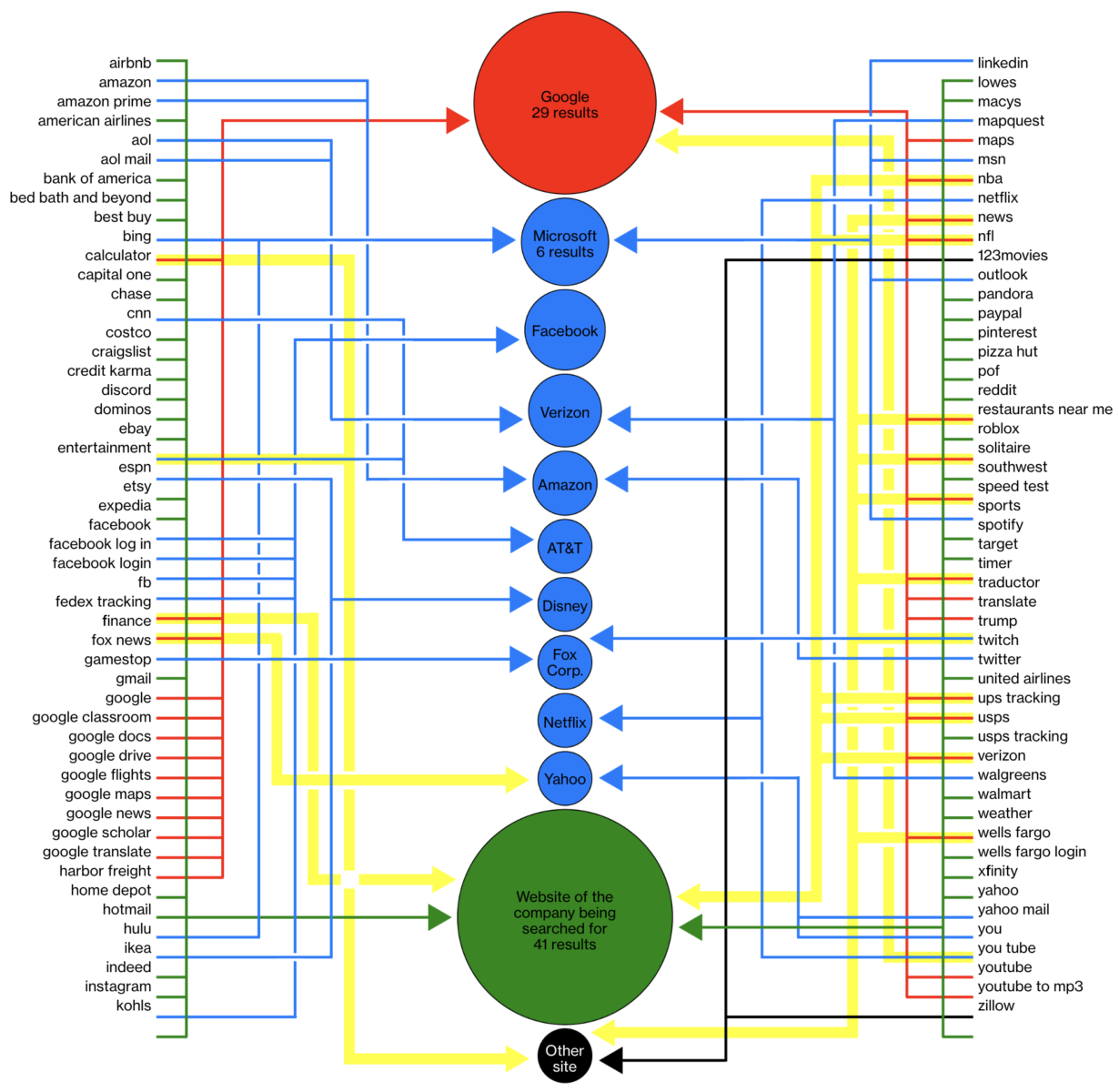 Among the 100 most common searches, a Google product or service is the top result 29 times: Google’s Top Search Results Spotlight a...
Read More

