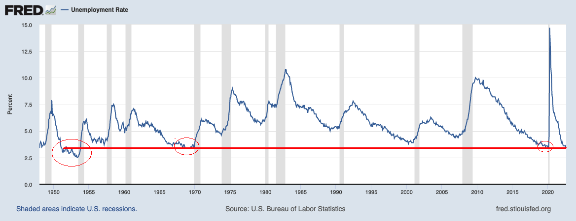
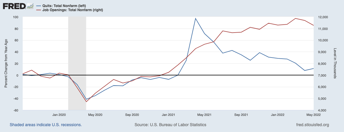
 I wanted to drop a quick note about the endless spate of layoff announcements — and why you should (mostly) ignore...
Read More
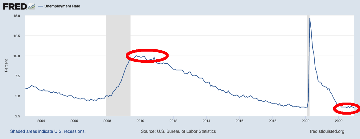
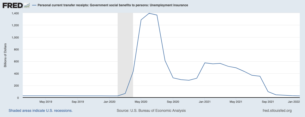
 Last Friday’s strong payroll data led to lots of chatter about the current labor situation. Often oversimplified and lacking in...
Read More
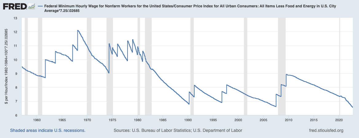
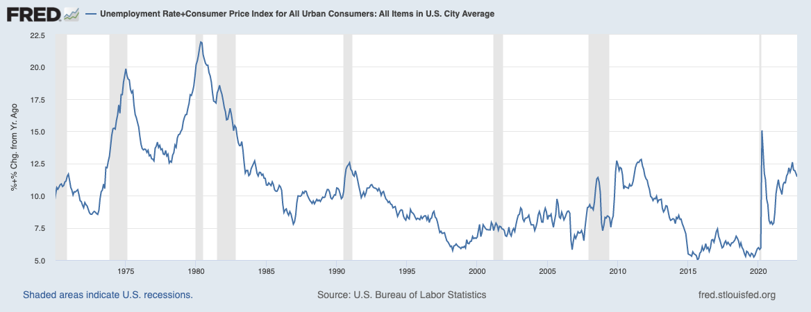 You may have missed this wonderful Josh Zumbrun column in the Wall Street Journal last week: “Inflation and Unemployment Both...
Read More
 So, it was just Labor Day Weekend, and while we all should be out NOT laboring, I spent part of the long holiday weekend thinking about a...
Read More
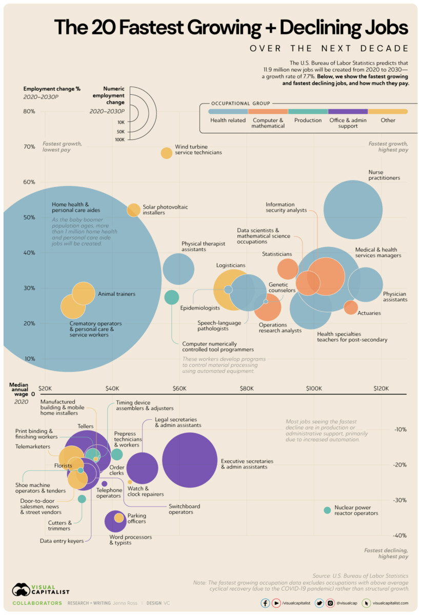 Source: Visual Capitalist It’s light summer posting season! I am heading out of town for a wedding, and then...
Read More
 Today is Fed day, when we get the 75 bps increase that dramatically increases the odds of a recession. The main storyline...
Read More
 Today is NFP day: We learned employment increased by 428,000 in April, and the unemployment rate was unchanged at 3.6%. Job...
Read More
 I have been wondering lately what the ramifications of the past two years will be. I enjoy thinking about things like this;...
Read More
 The Nonfarm payroll report today showed strength in hiring, modest wage increases, and a substantial decrease in...
Read More
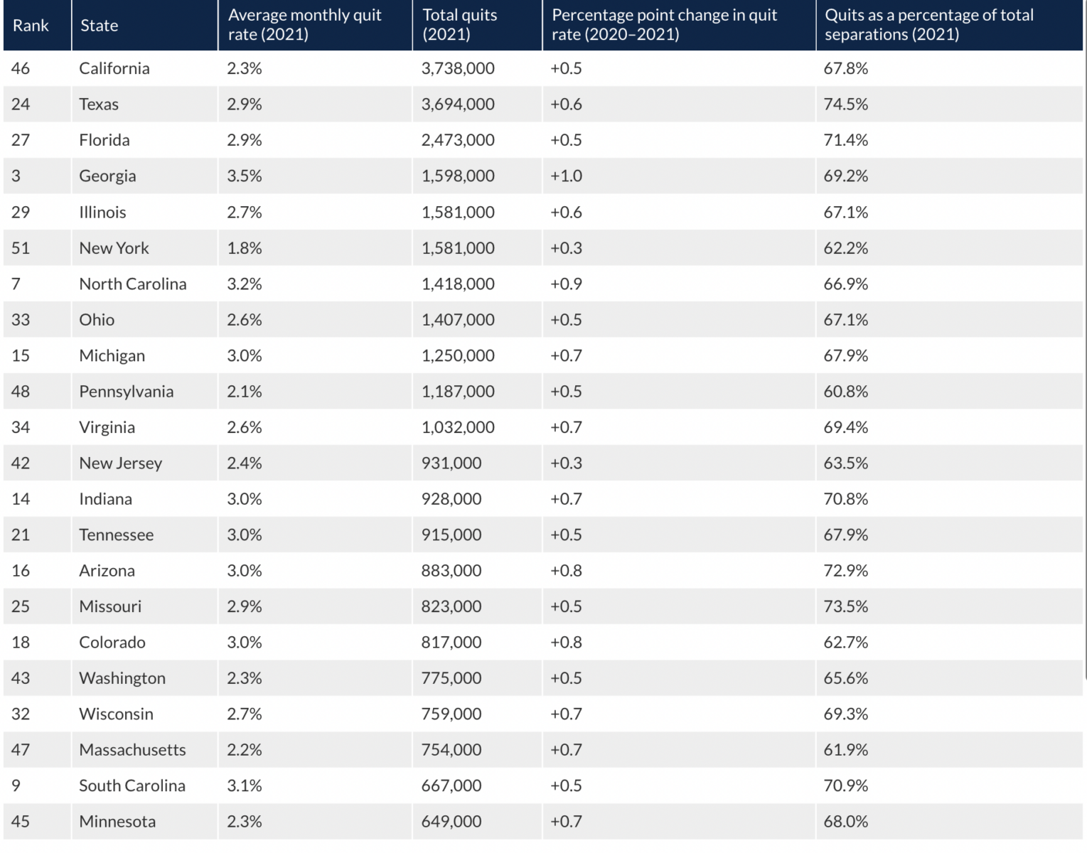 Source: Chamber of Commerce Really interesting data series from the Chamber of Commerce. I would sort this in a rather...
Read More
