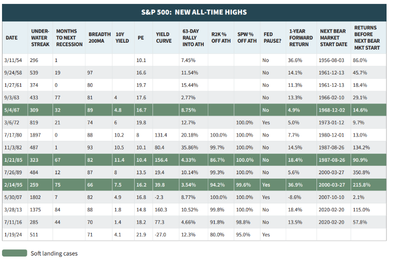
Updating Stock Market Rallies Since 1900

Email this post Print this post
By Barry Ritholtz - February 13th, 2012, 11:00AM

Over the weekend, I showed a Chart of the Day depicting all of the major rallies since 1900.

A sharp eyed reader pointed out that the author of this particular chart dated the beginning of this rally as October 2011, rather than March 2009.

Below you will find my corrected version, with the markets up approximately 98% going on 720 or so trading days. (my changes should be pretty obvious)

>

>

Chart of the Day responds to our questions, noting:

“Each of the rallies displayed on the chart followed a major Dow correction with a major Dow correction being defined as a decline of 15% or more. By that definition, the last Dow correction ended on October 3, 2011 with a decline of 16.8%. When compared to the latest major Dow correction, there were several relatively recent corrections that were shorter in duration (e.g. 1987 & 1990) and as for magnitude – the 1983-84 correction was similar with a decline of 15.6%.”

I’d like to see the same chart controlled for 20% and 30% corrections.

When Should Traders Be In or Out of Markets?

Email this post Print this post
By Barry Ritholtz - February 12th, 2012, 8:14PM

I met Joe Fahmy a few years ago (at a StockTwits event) and I have been impressed with his trading skills and diligence in refining his craft. He has been trading for 16 years, and has developed a rigorous investment strategy. As a hedge fund manager, he has successfully outperformed the markets for the past 13 quarters. You can read more about him at the end of this post.

His writing tends to be a little technical and chart focused; We spent some time chatting on the phone last week about his approach, and I suggested breaking a few topics into bite size, easy to understand, bullet points. This is the first of what hopefully turns into an ongoing series.

~~~

When should traders be in or out of the market?

There are times when traders should NOT be in the market. There are other times when the market is rocking and traders should get aggressive. How can you tell the difference? Here are 5 helpful tips.

Note: I’m a trader, not an investor. I am looking for superior out-performance by being in the best stocks I can find during healthy times.

1) Accumulation and Distribution Days: When should traders go to cash? Follow the big boys! The big institutions control the market, so pay attention to their actions by tracking accumulation and distribution days. When institutional selling builds up over a short period of time (2-4 weeks) AND leading stocks start to break down, that is a great sign to start raising cash. Why? Because 4 out of 5 stocks move in the general direction of the market. I don’t care how good the company is, when the market’s in a downtrend, you don’t want to fight it.

2) Uptrends and Downtrends: Don’t get caught up with the terms Bull and Bear market. Just recognize if we are in an uptrend or a downtrend. For example, use the 50-day moving average on the NASDAQ Composite as a general indicator to be in or out of the market. Above the line usually means we’re in an uptrend and it’s a green light to be in stocks…below the line, downtrend and red light.

3) Scale In: When conditions start to improve, SLOWLY scale back in. There’s no reason to rush. Take a few positions and test the waters. If the rally is for real, there will be PLENTY OF TIME to make money. If you are wrong, at least you can get out quick with minimal damage and protect your portfolio. Think Defense First!

4) Buy the Strongest Earnings & Sales Growth: When markets are in a confirmed uptrend, what stocks should you buy? Be in the best! Don’t settle for low rate stocks. Look for companies that have strong earnings and sales growth. Why be in dead-money stocks with little growth potential? We’re in this to make money, right? So be in stocks that have a higher probability of moving up!

5) Fundamentals AND Technicals: Why does it only have to be one or the other? Why not USE BOTH! We want as many factors as possible in our favor when trading the market. Therefore, start with strong fundamental companies AND combine the proper technical timing to identify ideal entry points to effect your best risk vs reward trades.

These are my 5 measures for when to be in or out of the market. Note I do not rely on a single factor, but instead use multiple disciplines to facilitate trading, protect my capital and maximize returns.

Using every weapon available significantly improves your chances of surviving — and thiving — as a trader.

~~~

Fahmy holds seminars for active traders who want to improve their returns (I will be discussing trader psychology and cognitive errors at the next NY seminar). Readers of the Big Picture who are interested will get a $500 discount on the full day event. Go to TradingBigWinners.com and enter the promotional code: “bigpicture500” for either the Los Angeles (2/18) or the New York (3/3) seminars. (I am only speaking at the NY event, and cannot get to the LA event — maybe next time).

Open Thread: “Where Are the Bears?”

Email this post Print this post
By Barry Ritholtz - February 9th, 2012, 7:15PM

I was speaking to a friend who is a well known, well regarded Technician. She stated: “I dont know anyone who is bearish . . . Even Nouriel Roubini flipped bullish.”

I thought that was an interesting observation.

While I am not sure who is bearish (Hussman, Shilling, Edwards, Faber, Belkin & Rogers) I do think this rally is rather hated, and has been for many quarters.

Here wee are with stocks making multi-year highs.

“Buy Strength” I was always taught . . . “Sell weakness.” Yet it seems no one wants to buy strength — people want to buy lower.

~~~

That’s our open thread for tonight: Where are the Bears? And what does this mean for the next 12 months of equity action?

What Are the Industrials and Transports Suggesting?

Email this post Print this post
By Barry Ritholtz - February 8th, 2012, 7:00AM

Dow Theory — a study of the relationship between the Industrials and the Transports — are suggesting a potential inflection point is nearing.

A move above 12,900 in the Dow Industrials would surpass the April 2011 highs, and the bulls would like to see that confirmed by the Trannies getting over 5630.

As we see from the indices via The Chart Store below, both the Industrials & Trannies are on the verge of that breakout. Just note that Classic Technical analysis requires you wait for the breakout/breakdown confirmation, rather than anticipate it.

Caveat: I am not a Dow Theorist, and this is a grossly oversimplified explanation. For more details, Wikipedia has an excellent primer on the major tenets of Dow Theory. Or check out Richard Russell’s The History of the Dow Theory.

>

Click to enlarge:

˜˜˜

Source: The Chart Store

The All-January Barometer Is No Better Than Assuming The Stock Market Will Go Up Every Calendar Year

Email this post Print this post
By Bob Bronson - February 2nd, 2012, 8:30AM

Consistent with their bullish mood and histrionic reporting, CNBC talking heads are touting that the stock market’s performance in just ended January was the best in 15 years and that when it has been up, the rest of the year has been up 87% of the time.

The statistical truth is that January’s performance has no meaningful impact on the rest of the year, as the following analysis demonstrates.  Especially note 1987, where that January was three times stronger than this January and during the next 11 months the stock market declined 9.9%, which even included a little rebound from the devastating 1987 Crash.  Do you remember 1987 being characterized as a bullish year?

What we call the All-January Barometer* has had seven false positives since 1940, where January was up, but the rest of the year was down.  If dividends are considered then there were six false positives, since from February through December of 1947 the U.S. stock market experienced a negative price-only return, but a positive total return for those following11 months.

BBBBBJanuary Rest of Year

1946       +7.0%           -17.6%

1947       +2.4%            -2.3%

1966       +0.5%           -13.5%

1987     +13.2%            -9.9%

1994       +3.3%            -4.6%

2001       +3.5%           -16.0%

2011       +2.3%            -2.3%

Last year, 2010, the All-January Barometer was a false positive since it did not work: January was up 2.3% and the rest of the year declined 2.3%,  The previous year, 2010, was by far the biggest of the 14 false negatives since 1940, since January was down 3.7%, but the rest of the year was up 17.1%.

In conclusion, January has failed to signal the direction for the rest of the year 20 to 21 out of the past 72 years, or about 29% of the time.*

And being correct 71% of the time** is statistically the same as betting that the stock market will be up every year, which it has been 52 out of the 72 years since 1940, or 72% of the time.

*. There are two other well-known January Barometers, which we call the “Jan5-Rest of Jan” and the “Jan5-Rest of Year,” each which use the stock market performance during of first five trading days to project the rest of January and the rest of the calendar year, respectively.  They have even lower Bayesian probability (true and false positives and negatives) than the “All-January Barometer”, or what we prefer to less ambiguously call the “Jan-Rest of Year Barometer” as we analyze and present here.

** The historical trend of the Jan-Rest Barometer has been getting worse over time since 13, or 62-65% of the 20 to 21 failures, have occurred during the 34 years since 1978, or the most recent 47% of the 72 years since 1940, which is about a 35% higher rate of failure than the earlier 38 years.

*** This is using Bayesian (true/false) probability analysis with the S&P 500 index (on a price-only basis, or without dividends) since 1951, and the DJIA 30 before 1951.   Regression analysis is much more useful since it also takes the magnitude into account, rather than just the positive or negative direction of the stock market’s performance.  However, careful analysis of the scattergram chart below shows that the trivial r-squared of 7% is due to small January performances, since the ten largest ones actually have a negatively-slope regression line (red dashed) that has almost twice the r-squared of 13.5%.

Click to enlarge:

The U.S. And Global Stock Markets Have Not Yet Topped Out

Email this post Print this post
By Bob Bronson - January 31st, 2012, 8:30AM

Trend-followers are becoming increasingly bullish because the stock market’s recent uptrend(s) continue to lengthen beyond their expectations. While these trends are clearly unsustainable and increasingly bearish on a contrarian basis, the bullish consensus is not likely at a cyclical turning point extreme – yet.

Very Short Term (days) and Short Term (weeks)

At Thursday morning’s high, the S&P 500 index (SPX) was up 9% in just 23 days, or a whopping 166% annualized, from its Dec 19 low just before the start of the predictable Year-end Holiday Season Rallies, which many market analysts, advisory newsletters and talking heads doubted would even be positive.

The SPX has been up seven of the past nine weeks, gaining 15%, more than a 120% annualized rate, from its Nov 23 low –- three days before which we recommended another buy in our counter-trend, double-profit-potential hedge strategy.

Intermediate Term (months)

The SPX is up five of the past six months through Jan from the Aug 9 low, just days before which time we initially recommended a counter-trend, double-profit-potential hedge strategy, especially in the NDX. In recent days it’s been making 11-year highs, as we originally forecasted. Also, the Dow 30 has hit 3.3-year highs.

Also through its Thursday high, the NDX is up 21% from its Oct 4 low, before which we forewarned about avoiding widespread investor fears of a bearish flag and double-bottom breakdown. We fully expected they would be a “bear trap” and recommended to buy again in our counter-trend, double-profit-potential hedge strategy.

While these are clearly unsustainable trends, we are not yet calling their top, and the following are some of the reasons.

Thursday the Conference Board (CB) released their new Leading Economic Index (new LEI), which rose in Dec. This is consistent with the stock market rising in Dec since six of the other nine components in the new LEI were up in Dec.

Keep in mind that all 0 components in the new LEI are reasonably coincident to each other, so that the group of nine excluding the stock market, is a useful confirming or non-confirming monthly fundamental indicator of the stock market. We further nuance the timing significance of each of the other components, as most are reported before the CB’s report of the weighted composite of all 10.

Last year’s July peak in the CB’s new LEI has not been exceeded by the Dec data, as you can see in the second chart below. This is consistent with the May 2 high in the stock market (SPX 1371) holding, which is helpful in zeroing in on the coming high in the now almost six-month rally since its Oct 4 low.

But it’s too early to have high confidence that the another new high two weeks ago in Initial Unemployment Claims will hold for long just because there was a 40% retracement in last Thursday’s reported data. See the first chart below.

Recall in our Jan 10 email to you that we pointed out several reasons of why the coming stock market rally high is not likely to be exceeded by the Annual Cycle’s Strong Season high in March through May in a Presidential election year during a Supercycle Winter.

So along with the new LEI and other fundamental and technical indicators in our forecasting models (see the summary table at the bottom) the odds are strong that the best opportunity for taking at least partial profits in the long positions of our counter-trend, double-profit potential strategy is close at hand.

For example, the end of a very short term (days) burst following the coming announcement of an agreement between Greece and its private creditors could create that selling opportunity. If you’re a Wall Street Journal subscriber:
http://www.marketwatch.com/story/hopes-rise-for-greek-debt-deal-2012-01-27
Here’s Bloomberg’s publicly available article on the coming debt swap deal:
http://www.bloomberg.com/news/2012-01-27/greek-debt-talks-drag-on-as-lagarde-keeps-pressure-on-creditors.html

We’ve also updated our quarterly Core Business Cycle chart – third one below – with Friday’s reported initial estimates of Q4 ’11 GDP. Notice that it undercuts the headline report of 1.8% GDP growth, since it’s more important than most any other metric from GDP and it reflects decelerating growth of only 1.4%, down from 2.0% in Q3.

In this regard, we’ve added a technical projection, along with a pair of explanatory charts, illustrating how it was derived. By itself, it suggests the coming business cycle peak and start of the next U.S. recession could be late in the current quarter, but more likely no later than in Q2. Keep in mind that it does not give a lot of information about the extent of the current stock market rally on a very short term (days) or even on a short term (weeks) basis, especially since the “no foreseeable U.S. recession” and “The Fed’s QE 3 is right around the corner” camps are still growing.

We will do the same with our per capita adjustment of the CB’s newly revised Monthly Coincident Economic Indicator Index (revised CEI) when we receive it. The CB does not make their numerical historical data freely available – only the past seven months is reported each month – but they do publish a 12-year chart of the data, which we have analyzed and annotated further below. The coming business cycle peak and start of the U.S. recession, joining the one already underway in Europe (Germany’s Q4 GDP was negative) and in Japan (their entire 2011 GDP results were just revised from slightly positive to slightly negative) – for Wall Street Journal subscribers see:
http://www.marketwatch.com/story/lending-data-points-to-euro-zone-credit-crunch-2012-01-27?siteid=bnbh
and the slowdown in China, don’t tightly time the end of the current stock market rally from its Aug 9 and Dec 4 lows, but they strongly suggest the rally won’t last much longer or go much higher, despite trend-follower’s growing enthusiasm. In fact, to the contrary, we fully expect that consensus to broaden, as the least sophisticated trend-followers join the permabull institutions in rationalizing why they can’t “afford” to miss the underestimated upside opportunity. Be alert to the
CNBC talking heads stumbling over each other to make the “no foreseeable U.S. recession” and “the Fed’s QE3 is just around the corner” claims chiding anyone who disagrees. Much more often than not the peak of their crescendo marks the exact top.

The following chart, with our S&P 500 overlay and annotations, illustrates how the CB’s new LEI and revised CEI better explain our forecasts for double dips in both
the economy and stock market, as well as what’s coming, which will be eventually called a double dip in both, the consensus having rejected that scenario last summer.

The following is a chart illustrating Friday’s report of Q4 GDP data that constitutes our Core Business Cycle metric, which could be called private domestic final demand.
It is real GDP per capita, less private sector inventories, government spending and net foreign trade, since they’re not consistently pro-cyclical and can be very volatile.

The Core Business Cycle part of GDP data shows the stock market (SPX is in the background) is quite overvalued, since the stock market has retraced much more
than the economic recovery has since their ’07 peaks. This does not even consider that our stock market to GDP valuation oscillator hasn’t yet reached its reversion-to-the-extreme target area that we expect it will when the coming U.S. recession ends.

The chart also shows a technical extrapolation – blue dashed arrow – for the current quarter, which suggests the economic recovery will peak and thus the coming U.S.
recession will start in late Q1 ’12. That extrapolation is based on the simple assumption that the deceleration in growth from Q3 to Q4 last year will continue, as is illustrated in the pair of explanatory charts further below.

While it’s a conservative numerical extrapolation of velocity and acceleration in the most meaningful and prescient GDP data, and thus is interesting all by itself, it’s not
a fundamentally-based factor upon which we make our business cycle calls. It is presented because it’s reasonably consistent with the implication from the CB’s new
LEI, as explained above, and with the best-fit extrapolation of the Fed’s Industrial Production index that we presented to you nine days ago.

How Bullish is the Golden Cross ? (UPDATED)

Email this post Print this post
By Barry Ritholtz - January 30th, 2012, 12:00PM

Pinging around trading desks last week was a report from Birinyi Research on the Golden Cross. Given where prices are (and the days dropping off the MA from 200 days ago) the S&P Composite is likely to see the Golden Cross soon

Here’s the excerpt:

“There were 26 instances in the past 50 years when the S&P 500’s short-term average crossed above the long-term gauge, according to Birinyi. The index rose 81 percent of the time with an average increase of 6.6 percent in the next six months, the data show.

Stocks posted bigger returns when the S&P 500’s 50-day rose above a falling 200-day, Birinyi data show. The index jumped an average 10 percent over the next six months, according to the study.”

There were two unfortunate problems errors in that piece: First, there were two mistakes for two specific years (1/26/72 and 9/15/94). That is based on Ron Griess’ work, using data from The Chart Store.

Second, they used an odd time period — 1960 to present. Data exists back to 1930s, so why not use it? The usual answer is data mining, and as we see below, that very much applies here. The post 1960 data is far more bullish than the earlier data — so why use it?

Overall, the Golden Cross does have a positive bias — its just not nearly as Bullish as that Birinyi report suggests. (File that in the blue recycle bin)

The following two tables and 17 charts (from The Chart Store) show the history of such events for the S&P Composite from 1930 to the present, including ALL 47 crosses where the 50 day moving average is rising and moves above the 200 day moving average. Not how the data after 1960 is much more bullish.

(I am surprised this came from Birinyi Research — I have never known them to data mine previously)

>

Click to enlarge:
Based on 50 day crossing a falling 200 day Moving Average


>

Based on 50 day crossing a rising 200 day Moving Average


All tables courtesy of The Chart Store

All >

Chart examples of nearly all of these are after the jump

Previously:
Worry About Important Things — Not The Death Cross (August 16th, 2011)

See also:
All Star Charts: Pay No Attention To This Golden Cross (January 30, 2012)

Read the rest of this entry »

Dow Jones Presentation on Correlation

Email this post Print this post
By Barry Ritholtz - January 27th, 2012, 11:00AM

If you missed yesterday’s discussion on Correlation at the Dow Jones Expert series lecture, the PowerPoint is here

Correlation Nation Presentation

Email this post Print this post
By Barry Ritholtz - January 27th, 2012, 7:36AM

As always, here is yesterday’s presentation for the Dow Jones Expert series. All of these charts have been on the blog before; the newest correlation slides are towards the back:

>

Correlation Nation

How Much Rally Is Left?

Email this post Print this post
By Barry Ritholtz - January 26th, 2012, 11:37AM

Wed, Jan 25, 2012 8:45 AM EST

>

Source: Market Rally of 2012 Is Almost Over: Bianco

43 queries. 0.546 seconds.