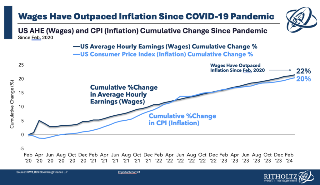
 Putting the final touches on my quarterly RWM client call, I wanted to share a chart that is surprising to many people. The...
Read More
The transcript from this week’s, MiB: Angus Deaton on America’s Wealth & Inequality, is below. You can stream...
Read More
This week, we speak with Sir Angus Deaton, who was awarded the Nobel Memorial Prize in Economic Sciences in...
Read More
 @TBPInvictus here; Let’s cut to the chase: “America’s Enormous Math Mistake” is a popular video on YouTube...
Read More
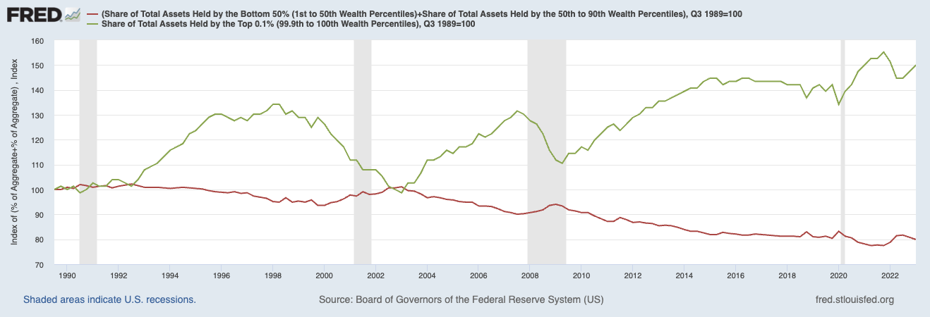 Source: FRED Wealth disparities get ever more lopsided the higher up the economic strata you climb; there is more disparity with...
Read More
@TBPInvictus here: Contrary to 40+ years and counting of “trickle down” narrative, the reality is that the gap between...
Read More
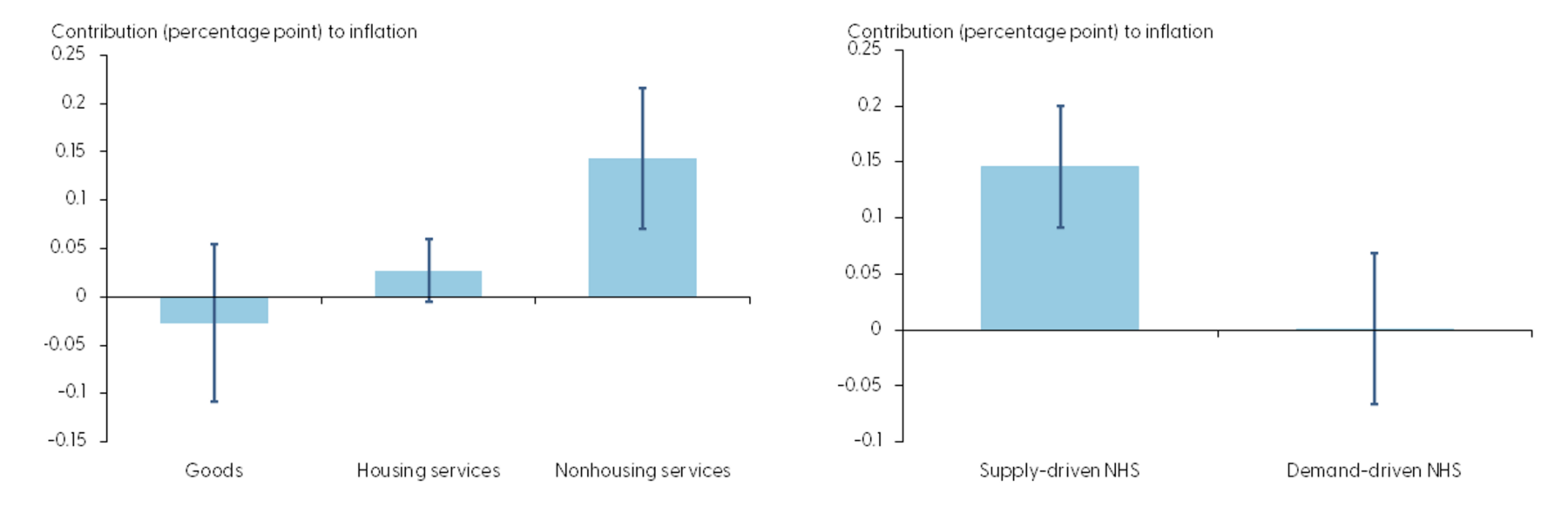 “Tight labor markets have raised concerns about the role of labor costs in persistently high inflation readings....
Read More
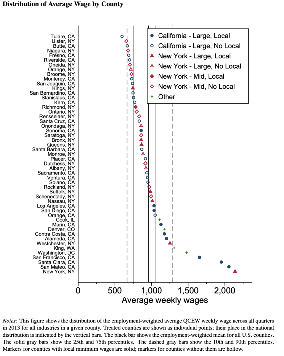 I have been writing about issues with the minimum wage for (it seems like) decades. During that time, consuming lots of academic...
Read More
 I love the idea of convergence — those rare times when multiple stories about very different issues seem to all land on the...
Read More
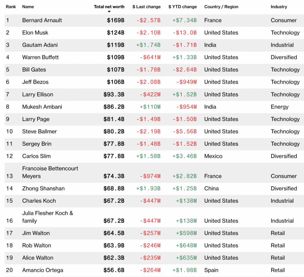 Source: Bloomberg Billionaires Index I was in the midst of my analysis of how the Fed would react to softening wage gains...
Read More
