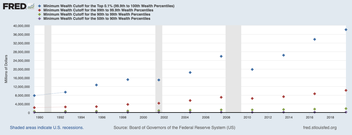
 I was working on a longer piece about which economic strata the Fed has the greatest impact on (its more complicated than you...
Read More
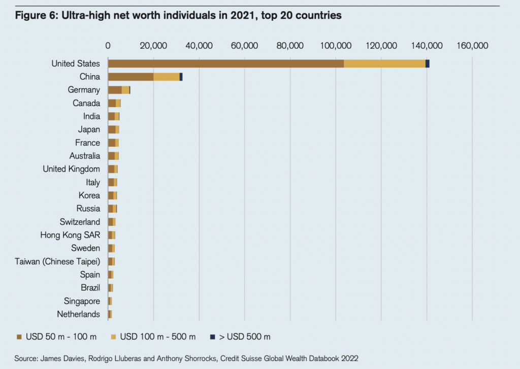 Every year, Credit Suisse puts out an in-depth look at wealth around the world (I often pull a chart or two for the reads). The...
Read More
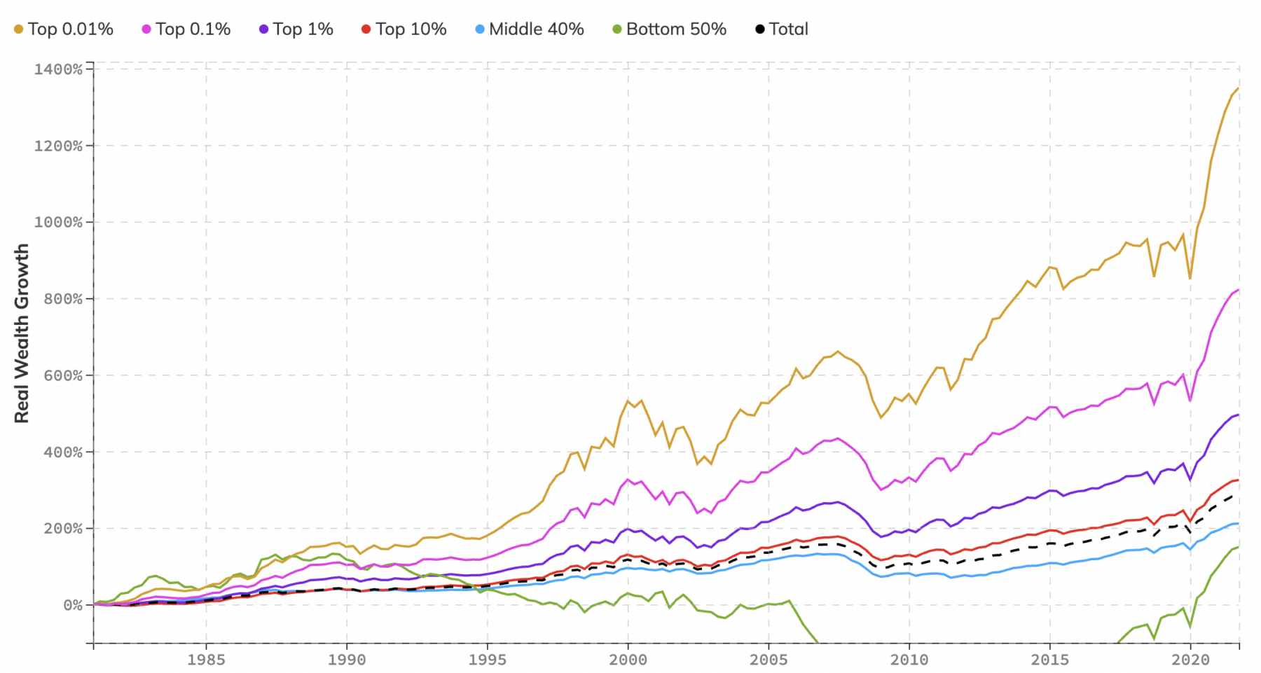 Wealth and wage inequality touch on many of my favorite topics: Saving & Investing, Wealth & Wages, Real Estate...
Read More
 I was speaking with my fishing buddy David Kotok recently about a research project he has been working on: “What are the...
Read More
“We have a problem understanding data over time.” Problem Understanding Data Over Time, Says Ritholtz Source: Bloomberg...
Read More
 I kinda buried the lede last week in my Structural or Transitory? post; we looked at a few inflation elements, including...
Read More
I spend an hour chatting with Pete about wages, inflation, and why so many economists are experts about the way the world...
Read More
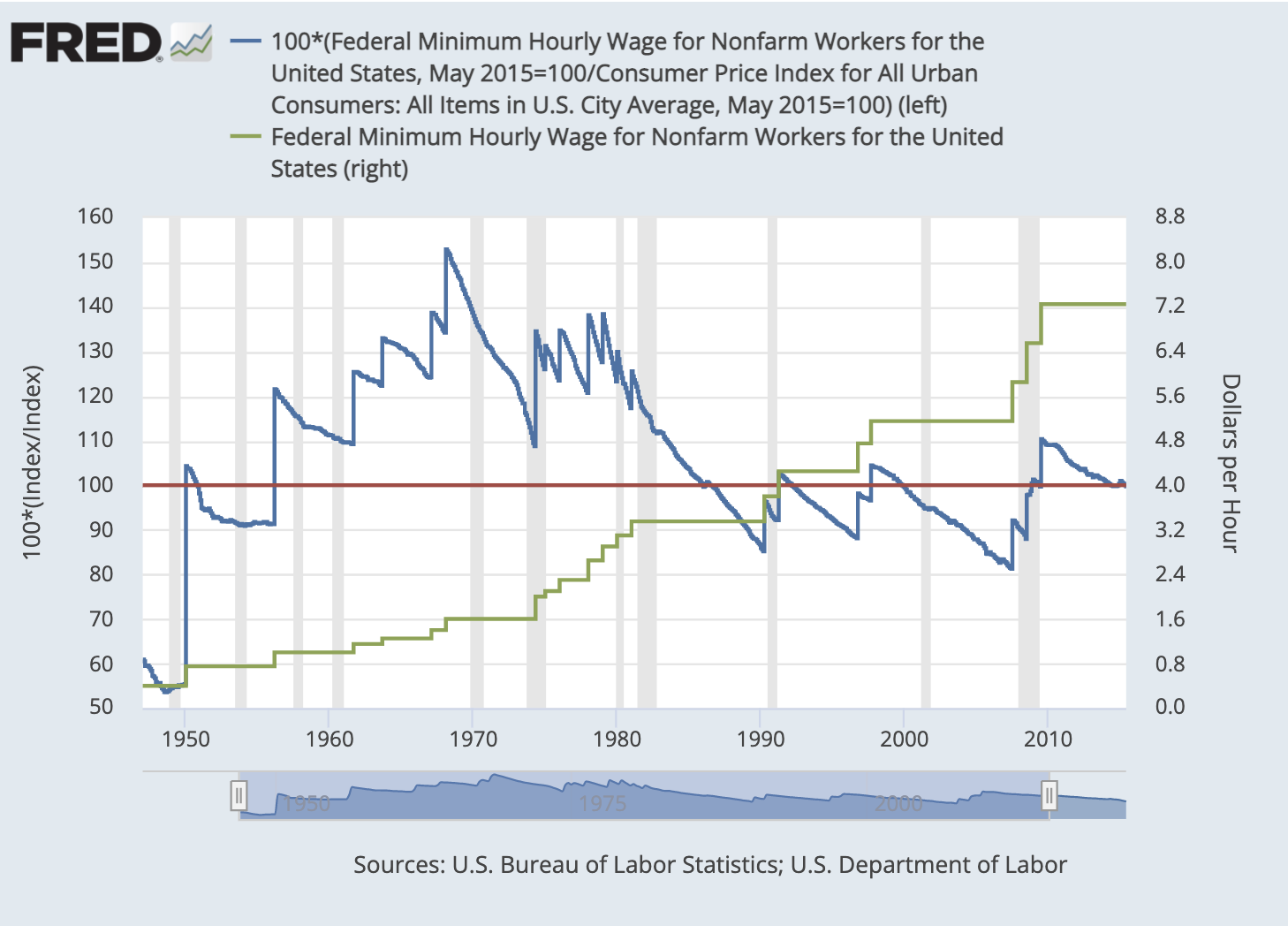
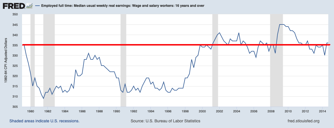 I am working on a longer commentary, but in the meanwhile, I wanted to share three quick charts which are incredibly instructive...
Read More
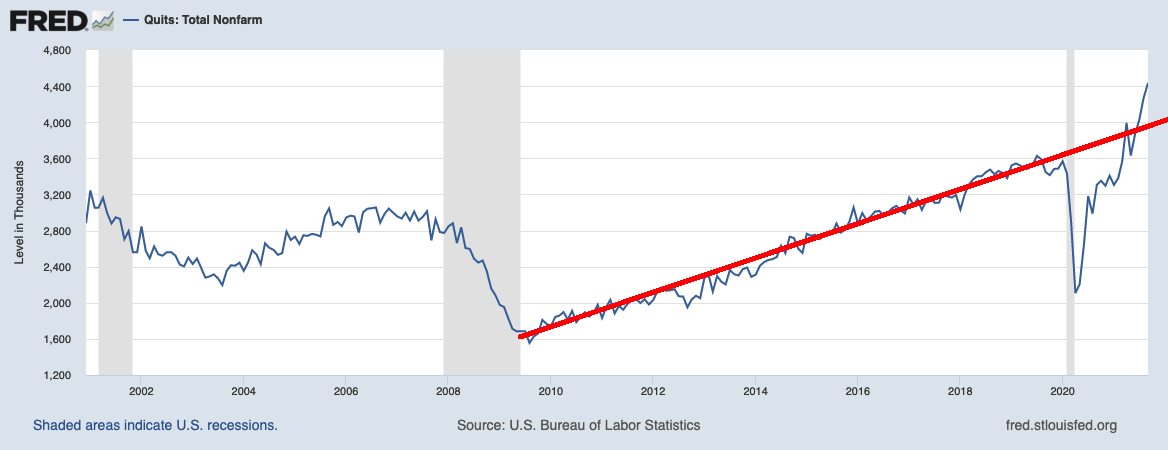 Quits: Total NonFarm Payrolls Quits: Professional & Business Services To hear an audio spoken word version of this...
Read More
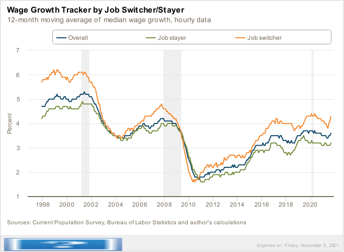 Wage Growth Tracker Source: Federal Reserve Bank of Atlanta Winners never quit — unless they want to see a bigger...
Read More
