Invictus here, requesting a correction from the WSJ.
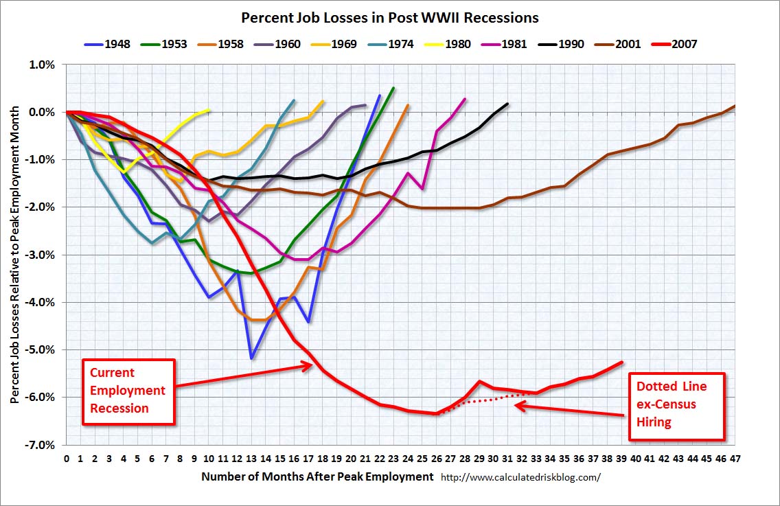
In an editorial on Saturday, the WSJ made the following demonstrably false claim, using a slightly modified Calculated Risk (Bill McBride) employment graph (emphasis mine):
The nearby chart compares the recovery rate in jobs after each of the last four recessions, and so far this one has been by far the weakest.
Unfortunately for the Journal, Bill’s chart does not represent what they say it represents, and they know it, or at least they should — Bill is a meticulous chart keeper. Bill’s chart indexes employment to peaks, not troughs, which is to say recessions’ inceptions, not their ends. Note Bill’s legend: “Number of Months After Peak Employment”:
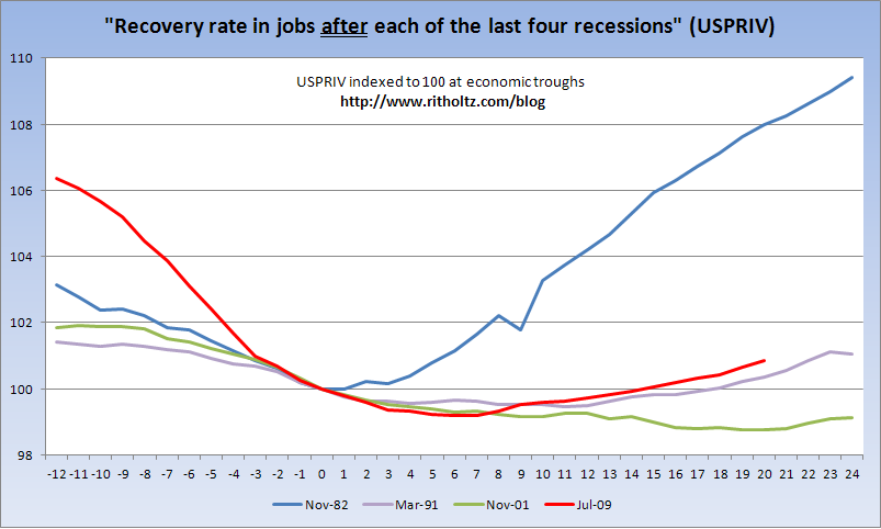
A chart that does represent what the Journal claims they’re showing (i.e. “the recovery rate in jobs after each of the last four recessions”) is immediately below. I’m using private payrolls only because we all know — and surely the Journal agrees — that the only good government employee is an unemployed government employee.
So let’s use the St. Louis Fed’s USPRIV — private payrolls only. [BR: That also will remove census noise] And let’s look what has actually transpired “after” — Journal’s word, not mine — “each of the last four recessions”:
>
(Click through for larger)

Source: St. Louis Fed Expansion Charts
So, in fact, the previous two jobs recoveries were actually weaker. (Using total nonfarm payrolls — FRED’s PAYEMS series, which includes those useless government workers — puts this recovery’s current level (100.4186) a smidge behind the ’91 recovery (100.6164) and still ahead of the 2001 recovery.)
I wrote previously — in September 2010 — about this exact issue, asking in that post:
If the economy is in recovery — a new cycle – for the the past 13 (or so) months — “technical” or not — should we perhaps be looking at the employment situation relative to the trough now, and not to the last peak?
Now, to be crystal clear — if folks want to continue to look at metrics from the December 2007 economic peak, it is their prerogative to do so. However, it is not their prerogative to claim they are presenting data comparing a metric “after” recessions when they are, in fact, doing nothing of the sort. Of course, it must be pointed out that using the peaks portrays Obama in the worst possible light, while using the troughs — as I pointed out in September — demonstrates that this recovery is actually stronger than the last two. But that is clearly not a message the Journal would ever care to convey.
I will not hold my breath waiting on their correction — you know, one in which they actually state that this jobs recovery is better than the previous two.
>
Previously:
Employment Indexed to Beginning/End of Recession (April 1st, 2011)


What's been said:
Discussions found on the web: