Warning: The following post is offered in the spirit of shameless self-promotion.
Those who prowl the web and consume all manner of economic research probably saw some things late last week that looked eerily familiar. Maybe you could place them, maybe you couldn’t. Perhaps you wondered, “Where have I seen that before?” Well, in at least two cases, you saw it right here at TBP.
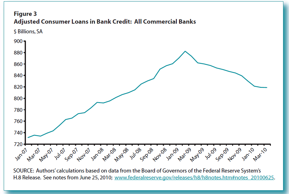
The St. Louis Fed published a piece titled A Jump in Consumer Loans? that analyzed the recent “spike” in consumer loans that, upon further review, wasn’t a spike at all:
At first glance, the upward spike in consumer loans during the months of March and April 2010 (see Figure 1) seems to suggest a dramatic expansion in credit. The spike itself could be seen as a strong signal that banks have loosened credit standards or have originated more consumer loans in the wake of an improving economy. While there have been improvements in consumer loans recently, the dramatic increases over the past few months have been caused by a new reporting requirement issued by the Financial Accounting Standards Board.
They proceeded to show an adjusted chart that took the FASB changes into account:
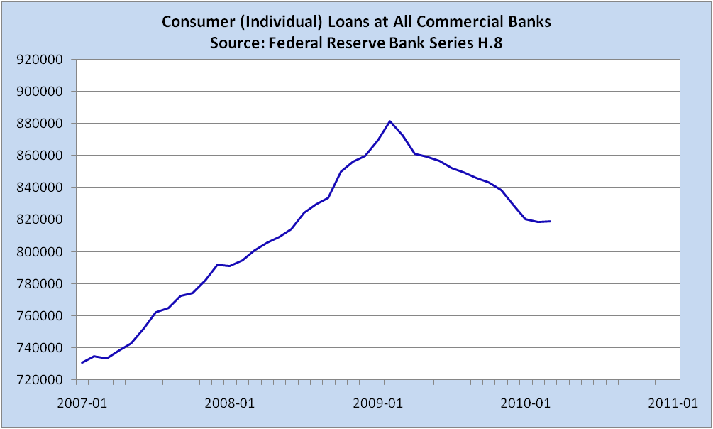
TBP readers may recall that we showed the following chart on April 26:
(Note: Difference in appearance due mostly to timeline — I went to 2011, St. Louis Fed only through March 2010 — and a bit to scale — 900 v. 920.)
That consumer loans had miraculously rebounded to a new all time high was, at the time, a badly mistaken talking point that was beginning to gain some traction.
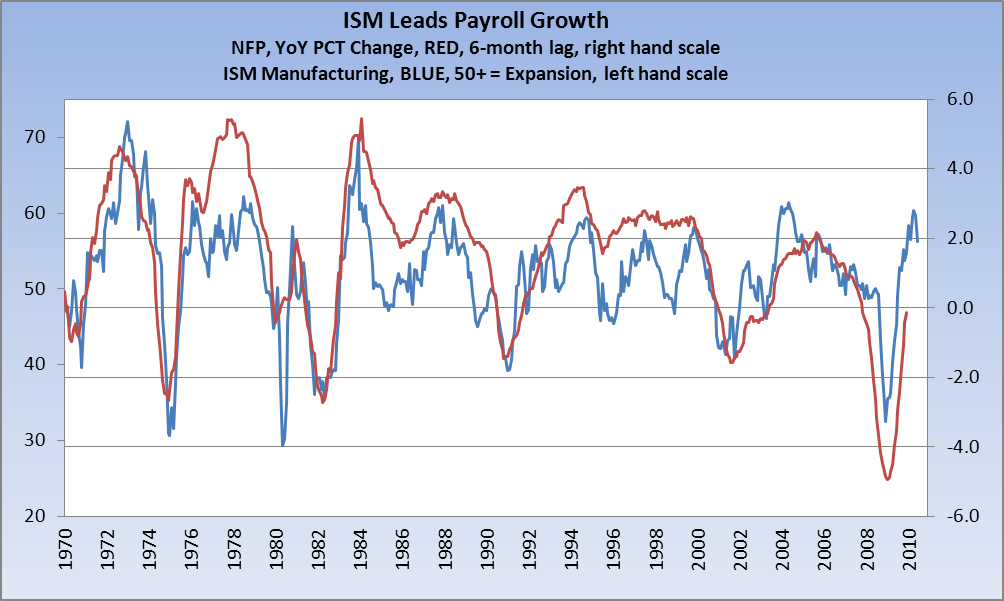
Moving on, we observed after the release of May ISM, and just before May NFP, that there was a relationship between the two that seemed to bode ill for the future of the labor market (see our post here on June 3). ISM seems to have peaked in April at just over 60 and now appears headed lower. We looked at the lag between ISM and payrolls and concluded that the payroll situation is bleak because we are not creating jobs rapidly enough in light of the fact that ISM seems to be rolling over. To illustrate the point, we presented a chart (which I’ve updated through last week’s releases):
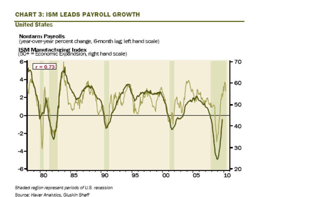
Crack economist David Rosenberg presented his readers with the same chart last week, but with considerably more information about the relationship. (Note that my chart goes back further than Dave’s, but they are identical from 1978 on.)
Said Rosie about this relationship:
ISM leads employment growth with a six-month lead time and with a decent 73% correlation.
The ISM is useful because it is timely, highly cyclical, moves in regular patterns and goes all the way back to 1948!
But here’s the rub. Never before have we hit a peak in ISM with employment growth still negative. That has never happened prior to this post-bubble experience. What is normal, and there are 15 ISM cycles over the past 62 years, is that job growth is positive at the ISM peak, and that peak, more often than not, is around 60 as was the case this time around in April.
On average, at the peak in ISM, year-over-year payroll growth is running at 3% and has another six months to go in terms of acceleration before the trend reverses. The median is 2.5%, as is the mode. And, the range is +1.0-5.3%. This time around, the pace was -1.1%. This means that not only will we never get back to the old pre-recession highs in employment, but that the jobless rate is going to grind ever higher in coming quarters and, in turn, that means so long as the laws of supply and demand are still relevant as far as the labour market is concerned, wages move from disinflation towards outright deflation.
So there you have it — a twofer of “read it here firsts.”
TBP — worth every dime you pay for it.


What's been said:
Discussions found on the web: